FAO Schwarz
Agency: Signal

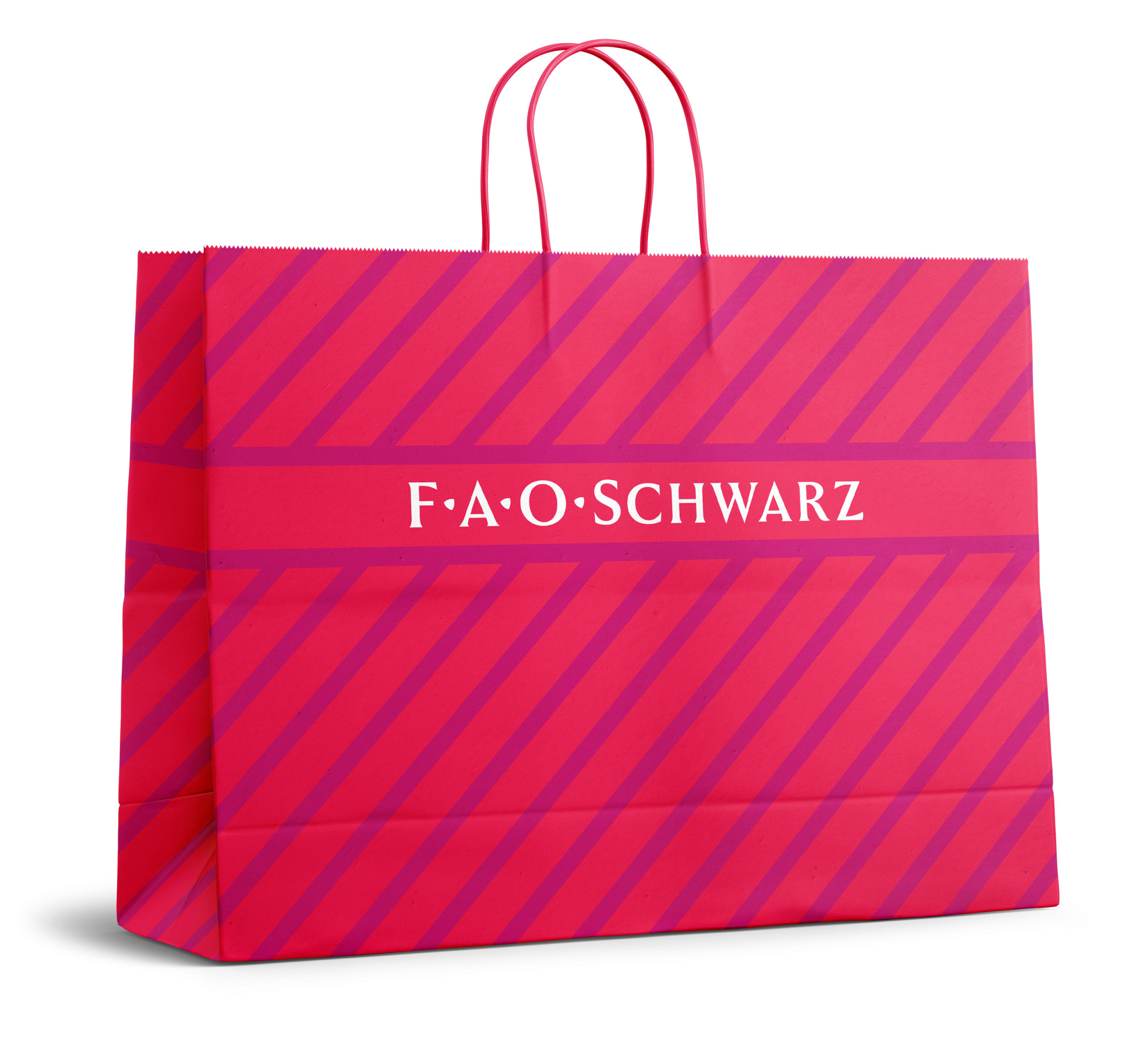
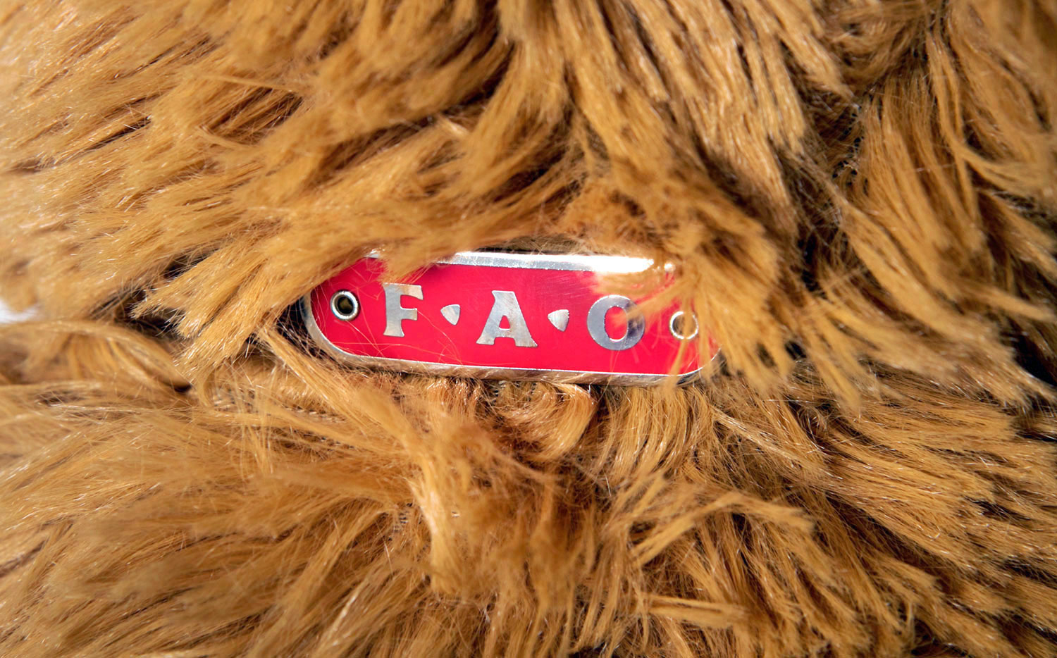
A comprehensive reinvention for the oldest toy store in America, which had seen its brand eroded through multiple changes of ownership. Our work began with a ruthless pruning of dozens of sub-brands that had been diluting the FAO Schwarz name. In place of the old toy soldier logo, which put off girls and older children, we designed a simple typographic mark like those of the store’s neighbors: Bergdorf Goodman, Tiffany, and Crate & Barrel. We added a simple three-letter monogram for subtler product branding. (The triangular midpoints were borrowed from Roman lapidary lettering.)
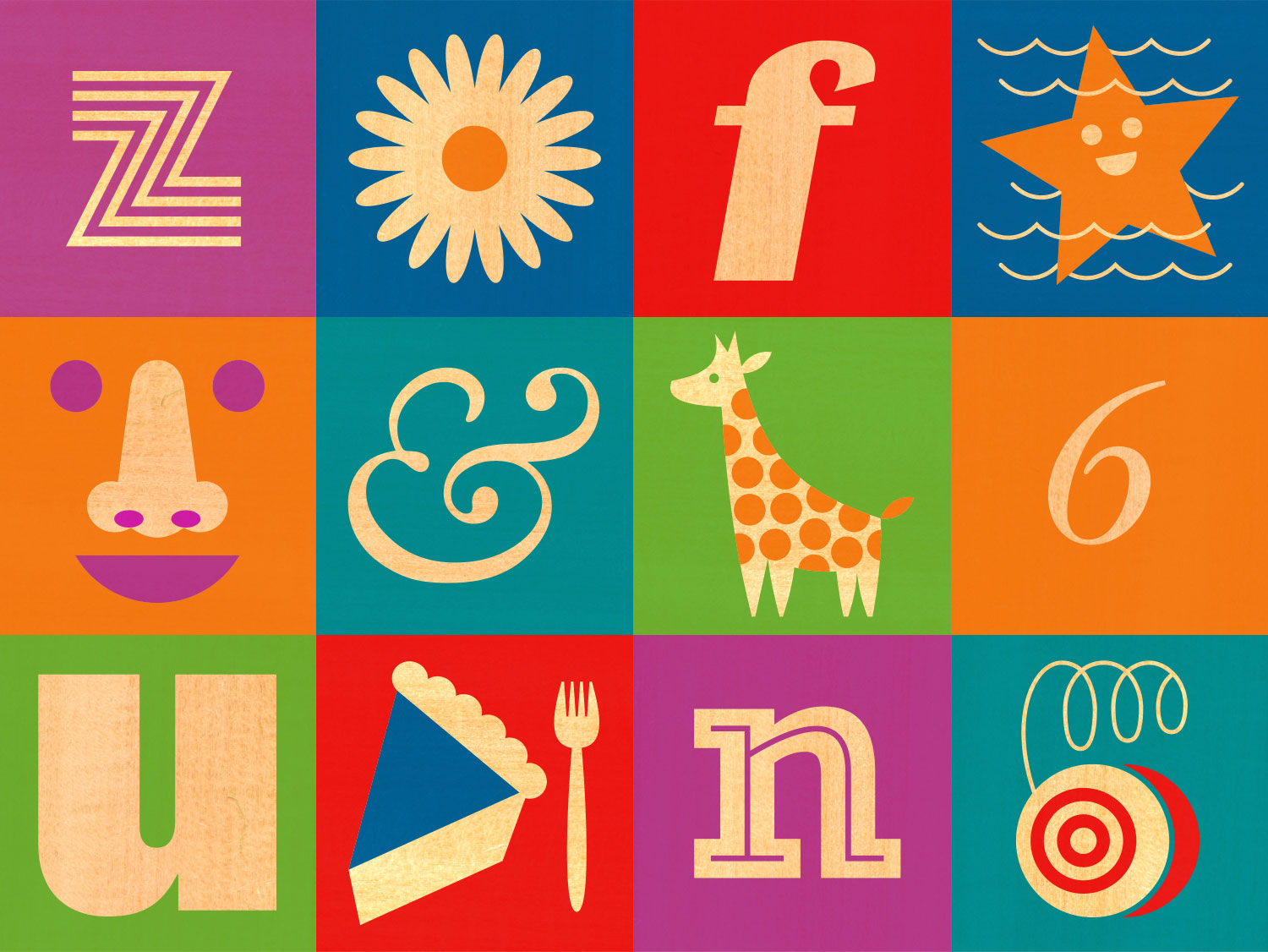
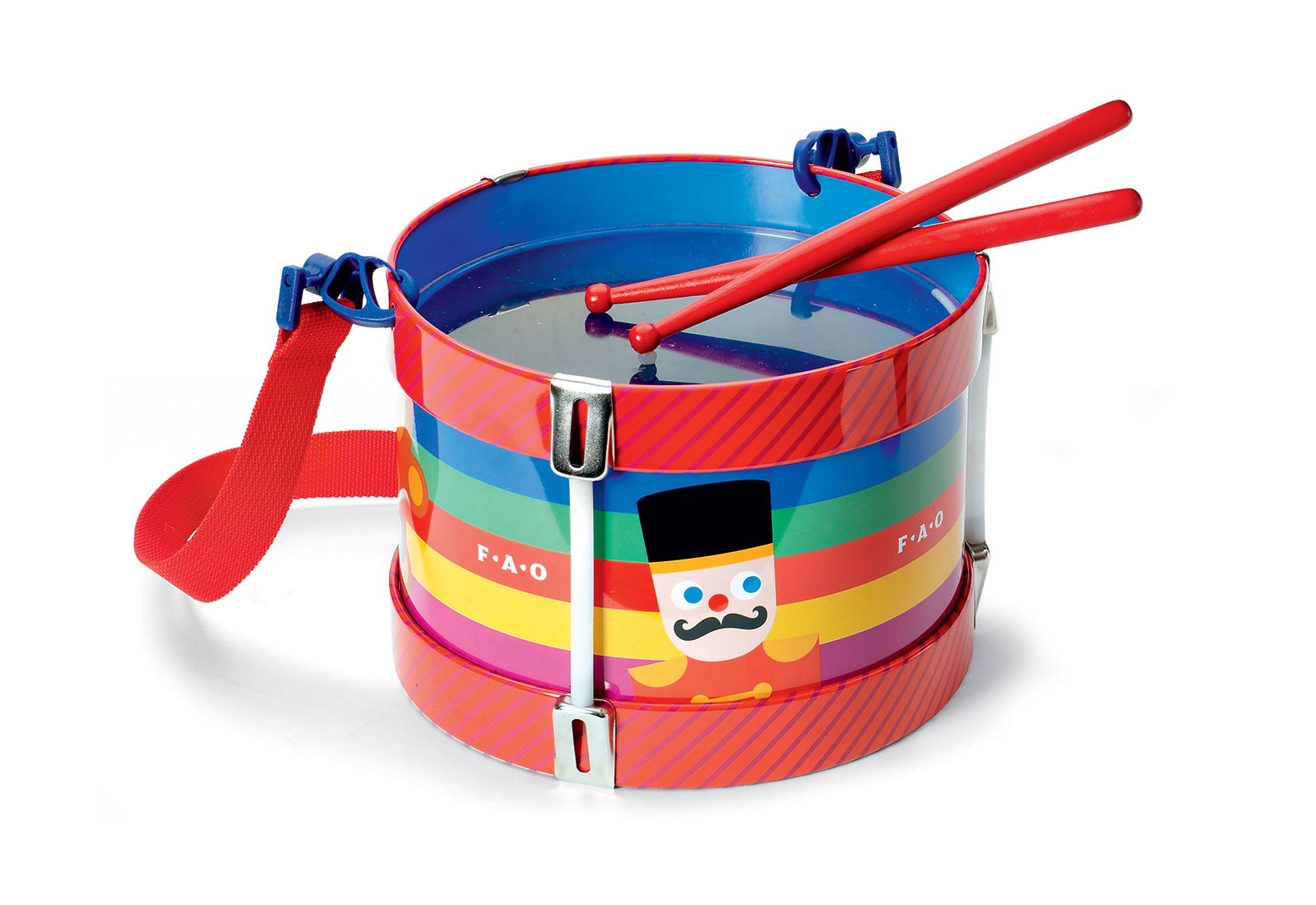
A diagonal stripe was chosen to serve as a secondary identifier. A collection of exclusive characters were created to enliven toys and collateral. Throughout FAO’s 2004 relaunch and for several years after, we were in charge of all aspects of the brand’s visual and editorial presence, which eventually grew to encompass coordinated packaging programs, merchandising, in-store graphics, signage, and even toy design, and culminated with the rollout of 260 new Macy’s shop-in-shops across the United States. Branding, character, packaging, and product design by Signal.


Agency: Signal