Sinter


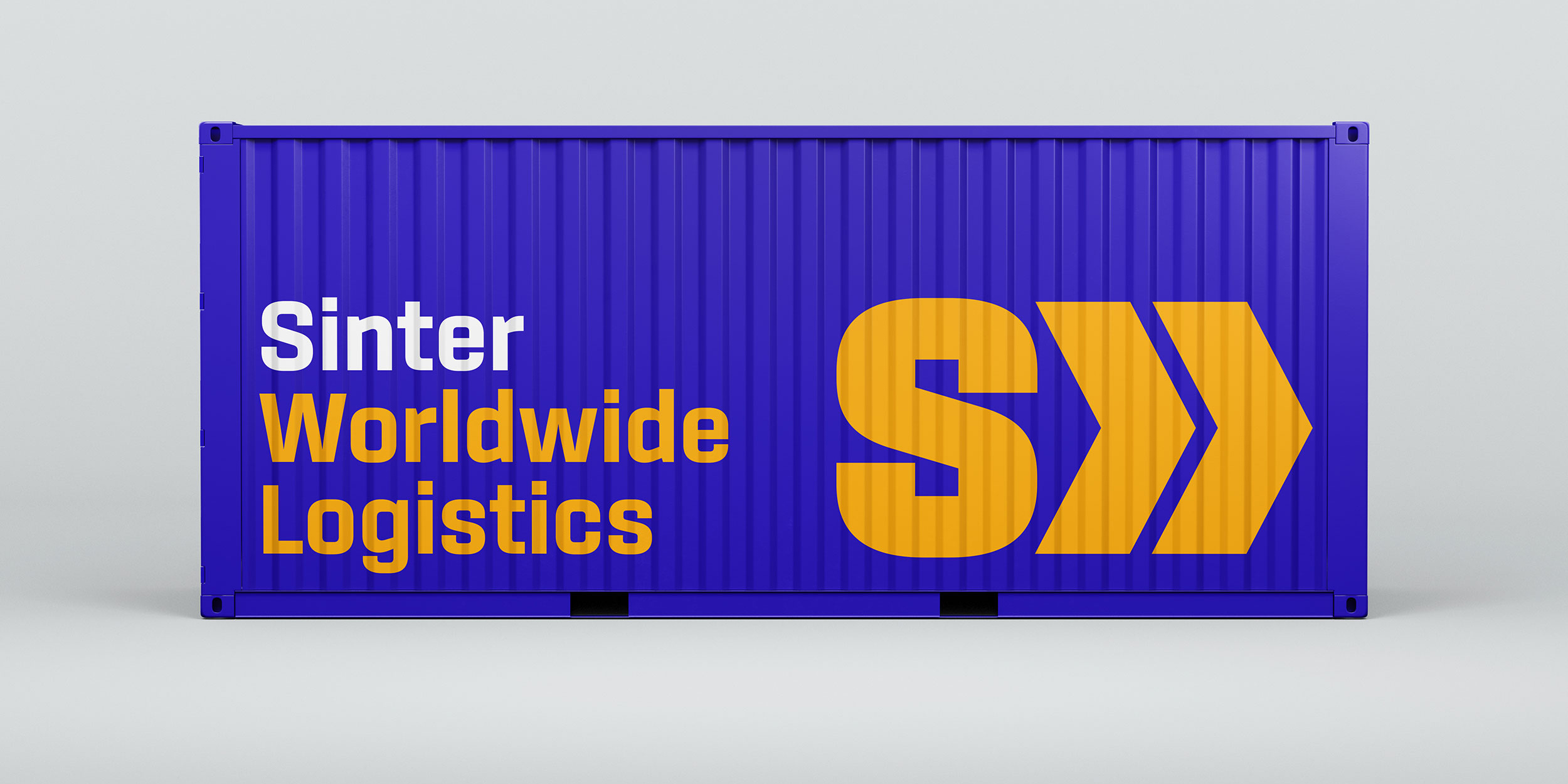


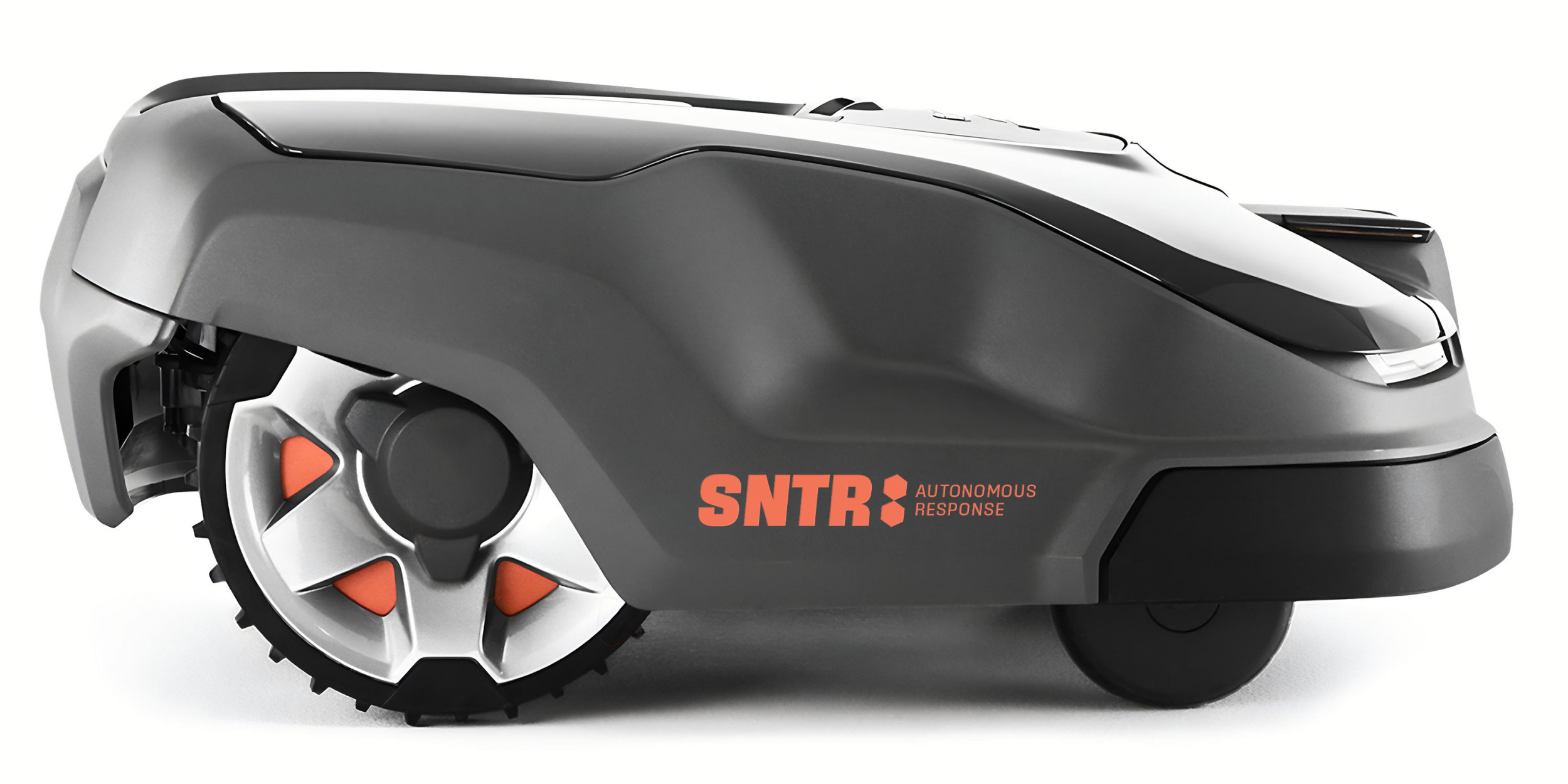

The future is squarish. Georg Trump knew it in 1930 when he designed City. Hermann Zapf knew it in 1949 when he designed Melior. Alessandro Butti knew it in 1952 when he designed Microgramma. Sinter isn’t about to argue. Based on a rounded rectangle, its geometry has been subtly refined for smoother reading. Its branches are angled in homage to OCR-A. A combination of open counters, unequivocal curves, and ruler-straight vertical and horizontal strokes suit it admirably for onscreen display. Sinter’s nine weights range from a waifish Thin to a hulking Ultra, each with a matching italic. It features tabular figures duplexed across all weights, case-sensitive punctuation, and support for over 130 languages.
To buy a license, please visit this site on a desktop, laptop, or tablet computer.