Exact


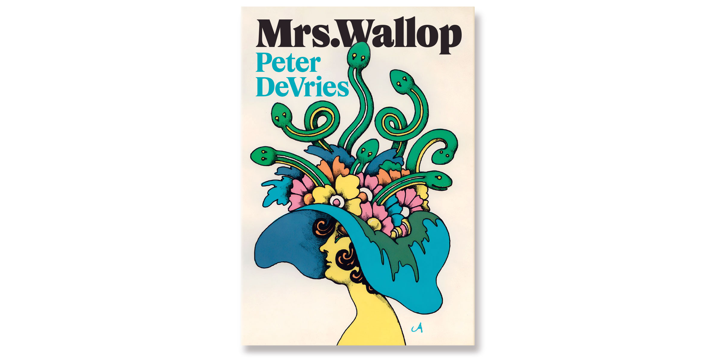


When we were a teenager putting together our first design portfolio, back in the days of rubber cement and X-Acto knives, we were obsessed with Times New Roman. We knew it was prissy and joyless, but we didn’t mind. We were prissy and joyless ourselves. We loved its air of strict, unbending neutrality, and we bought sheet upon Letraset sheet of it and used it for everything we could. But as we grew older and learned a bit about letters, we realised that it actually wasn’t very well made. This is not surprising, since TNR was art directed by Stanley Morison, a man who never pretended he could draw, and drawn by nobody in particular. An advertising lettering artist named Victor Lardent did the initial concept art. This was then turned over to the 1930s hive mind—the Monotype Drawing Office—and expanded into a range of weights and widths with no one, apparently, talking to anyone else throughout the process. TNR did its job as a modern newspaper type brilliantly without ever actually being any good. It subsequently became numbingly ubiquitous because it was less trouble to use than not, and at last was shunned by right-thinking designers everywhere. But in recent years typographers have come to find something heroic about TNR’s reticence, its dowdy elegance, its calm, inflexible unwillingness to please, and reconsiderations of TNR have become a genre unto themselves, and why shouldn’t Signal have a go? So we’ve redrawn it from scratch as a natively digital typeface for what we still like to think of as the 21st century, with unlumpy curves and some vague notion of organic unity and an italic that isn’t quite so Microsoft Executives Dancing. When we drew the bold weights, we found a bit of 70s funk creeping in, a bit of ITC Grouch, and we left it there. The X-Light came out a little bit Olive Oyl, and we left that in there too. In honor of the old days of kerning with an X-Acto knife, we named the new face Exact.
To buy a license, please visit this site on a desktop, laptop, or tablet computer.