Tenon
→
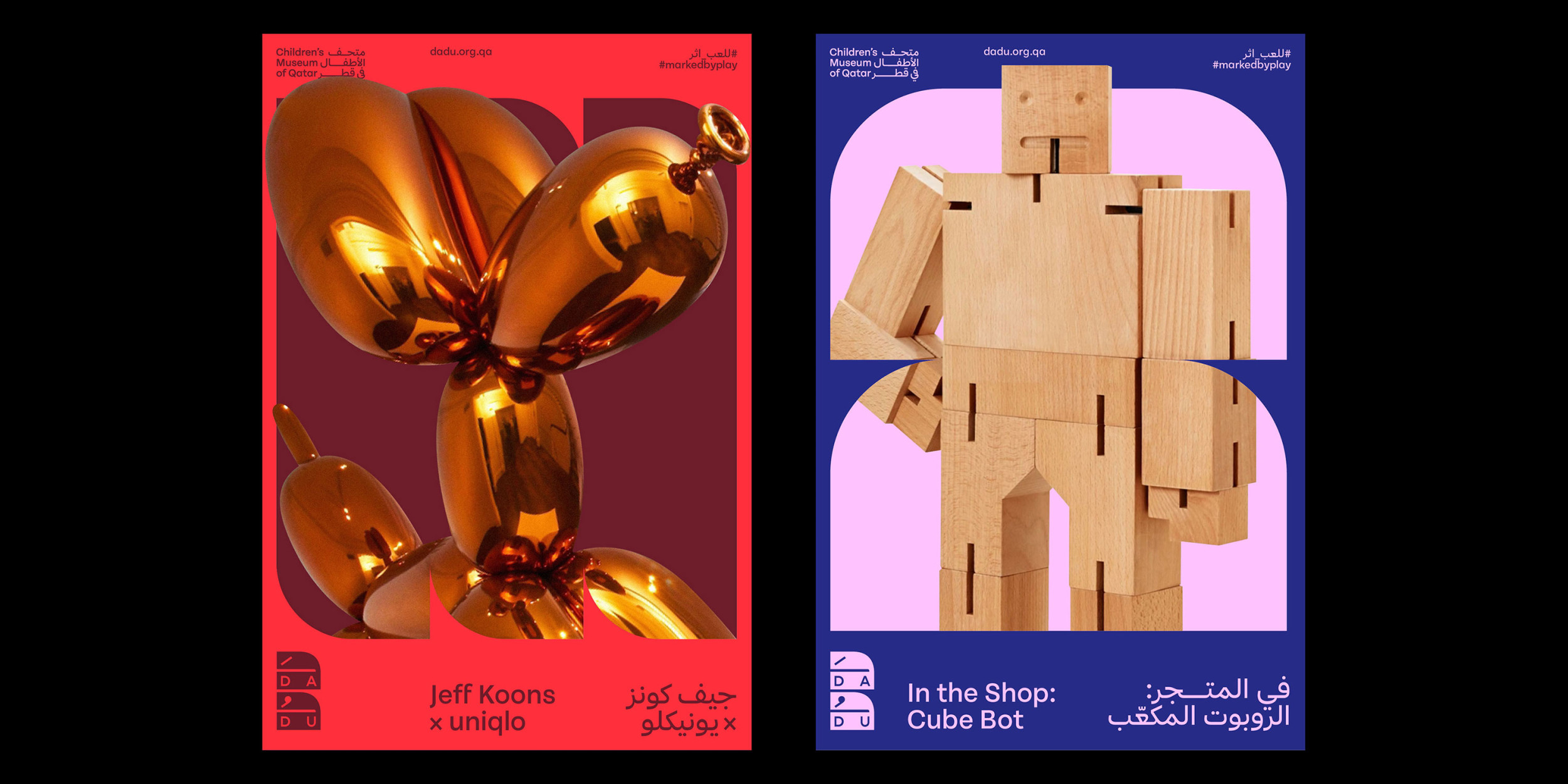
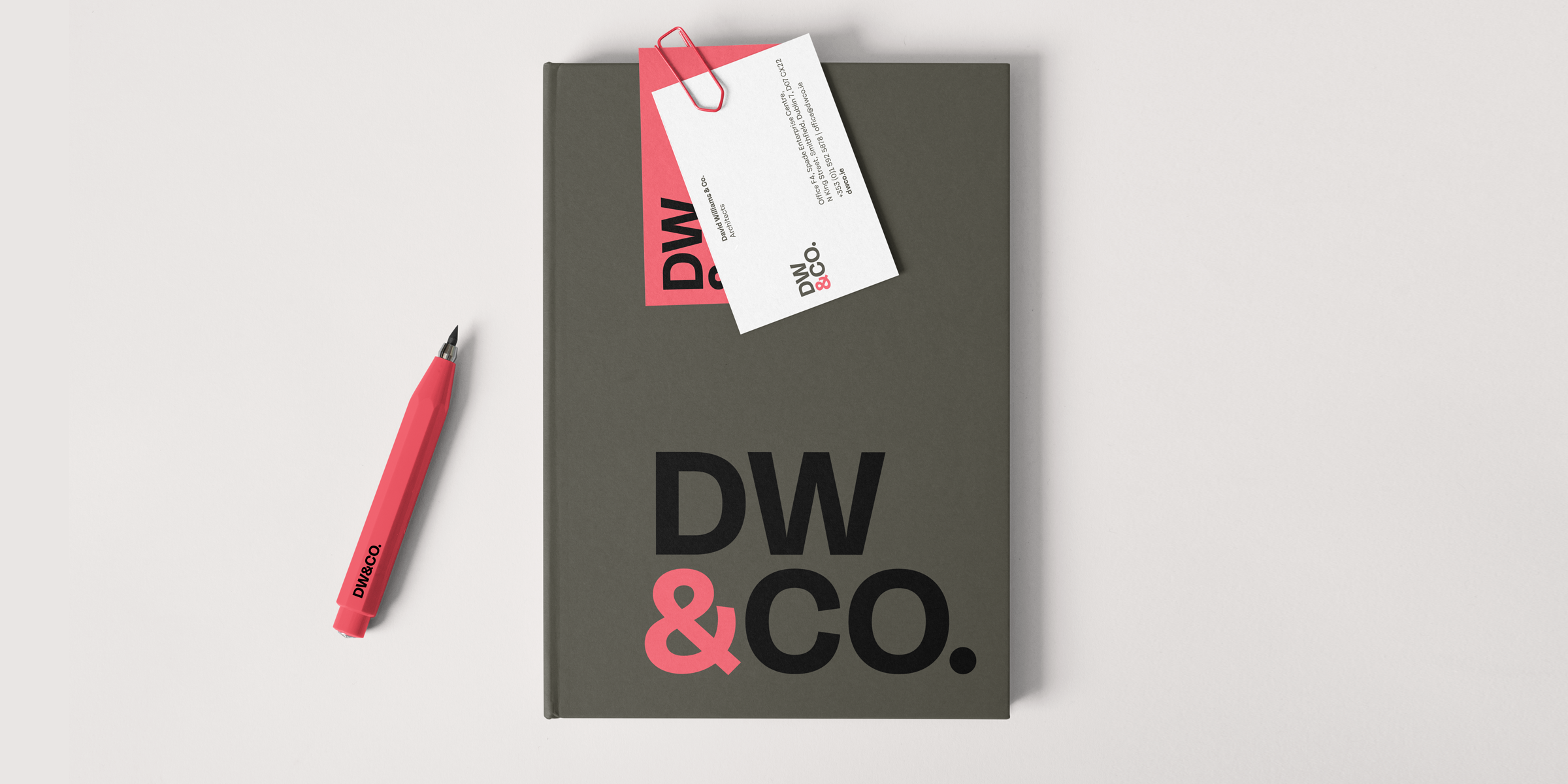
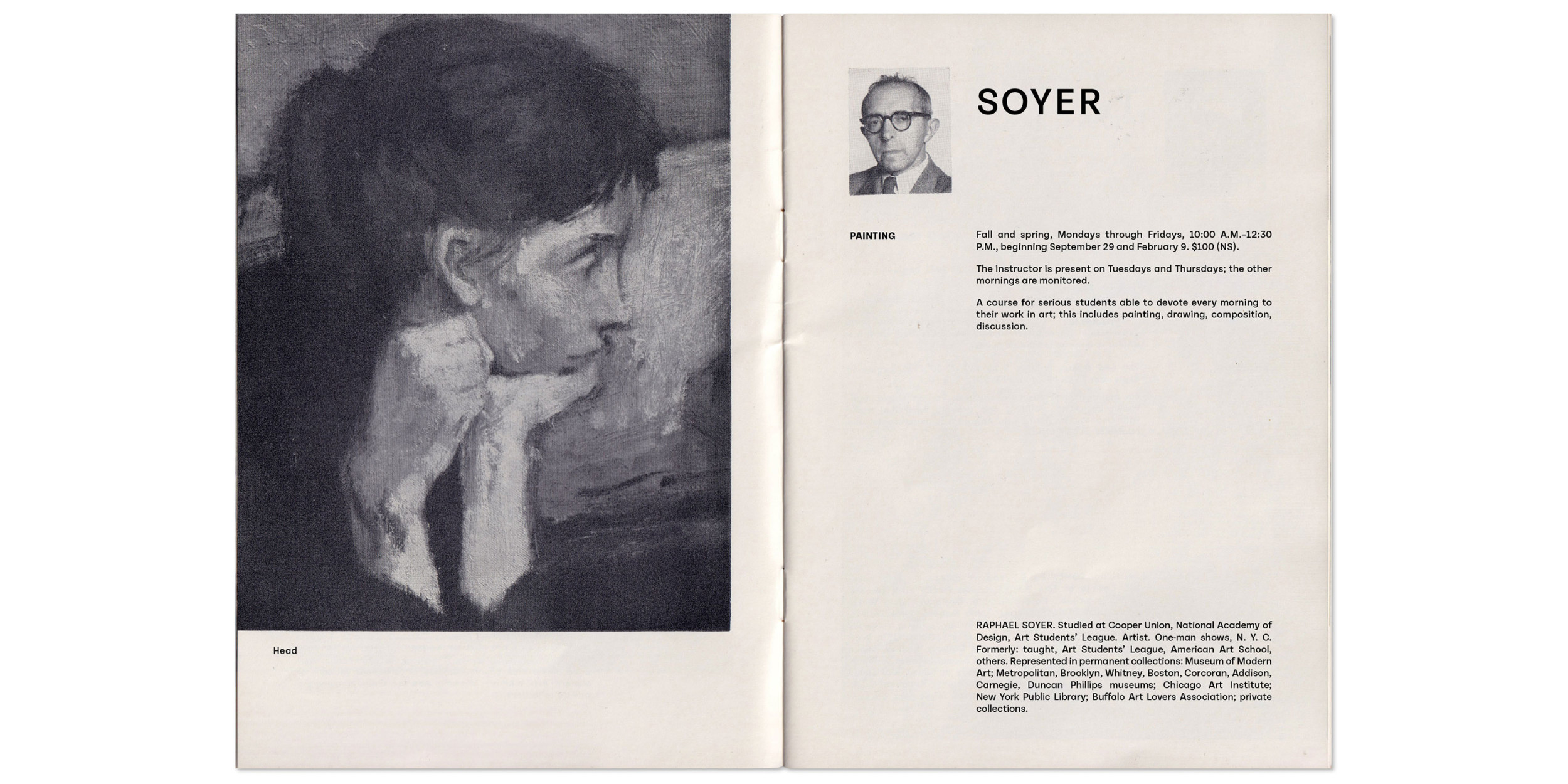
When we trimmed the serifs off our slab serif family Mortise, we found a plain, efficient sans that marches through the uncanny valley between grotesk and geometric, with almost circular bowls that lend extra energy to the line. Like its sibling, Tenon has open counters, a generous x-height, and wide proportions that suit small sizes and small screens. Used larger, its brisk, optimistic air makes it a good choice for projects ranging from editorial design to signage. It’s available in six weights, from the precise X-Light to the muscular X-Bold. Designed by Seán Mongey at Post and Max Phillips.
To buy a license, please visit this site on a desktop, laptop, or tablet computer.
Cart


