How & Why
Approach
Signal is a type foundry and design office. I founded it in New York City in 2012 after 20-odd years of type-focused branding work and moved it to Dublin when my Irish wife got homesick. We provide custom type design, logo development, typographic consulting, and a retail type library, much of it with a focus on branding.
Because I’ve worked for three decades launching branding systems across a range of industries, I have a good grasp of what brands need from type. I've learned to be flexible about style—every job has be shaped by the client’s needs and nature—and inflexible about craft. And I know that typography isn’t about type, but about what you make with it.
I grew up bookish in a house full of books, and it got me interested in those rows of little black marks books are made of. I did my first paid lettering job at fifteen. When I became a graphic designer, I started to study letters seriously and found that the best of them had a particular kind of beauty: the beauty of tools, airplanes, and bridges, of something rigorously shaped for a particular use. I found I wanted to draw more letters like that, so that the things I designed could be made of the very best stuff. And that’s what Signal tries to provide to designers.

Custom Type
Every brand needs good typefaces. Sometimes it makes sense to have them made to measure. For large concerns, commissioning a custom typeface is often cheaper than buying an enterprise license, and since custom licenses typically permit unlimited use, there’s no need to count users, track usage, or worry about falling out of compliance. The payment can be structured to suit your needs: typically, either a single lump sum that secures your rights in perpetuity a yearly fee paid for as long as the typeface is wanted.
But most importantly, a bespoke typeface works like a bespoke suit. It looks like quality. It fits. It reinforces your brand identity and unifies your organization’s visual presence, because it was purpose-built to do just that. To put it another way, a custom typeface lets your brand speak with a single consistent and compelling voice.
Each custom type design job starts with an estimate, which specifies usage and language support, as well as deadlines and payment structure. It also establishes a period of exclusivity, typically two to three years.
Once price and timeline have been agreed, it's the designer’s job to work with you to create a clear and focused brief. This will be more detailed than the estimate, including typical uses, a comprehensive glyph list, and overall stylistic direction.
I'll be researching your industry or area of activity to get an idea of the context in which the type will do its work. I'll also interview you to get a fuller understanding of what you do, how you do it, what you want to say, and who you want to say it to.
Listening is a key part of the designer's job, and I’ll be doing a lot of it. But arguing is sometimes part of the job, too, and I might do some of that as well. During the course of a project, both designer and client typically come up with more ideas than can be used. It’s my job to advise you on which might work and which probably won’t.

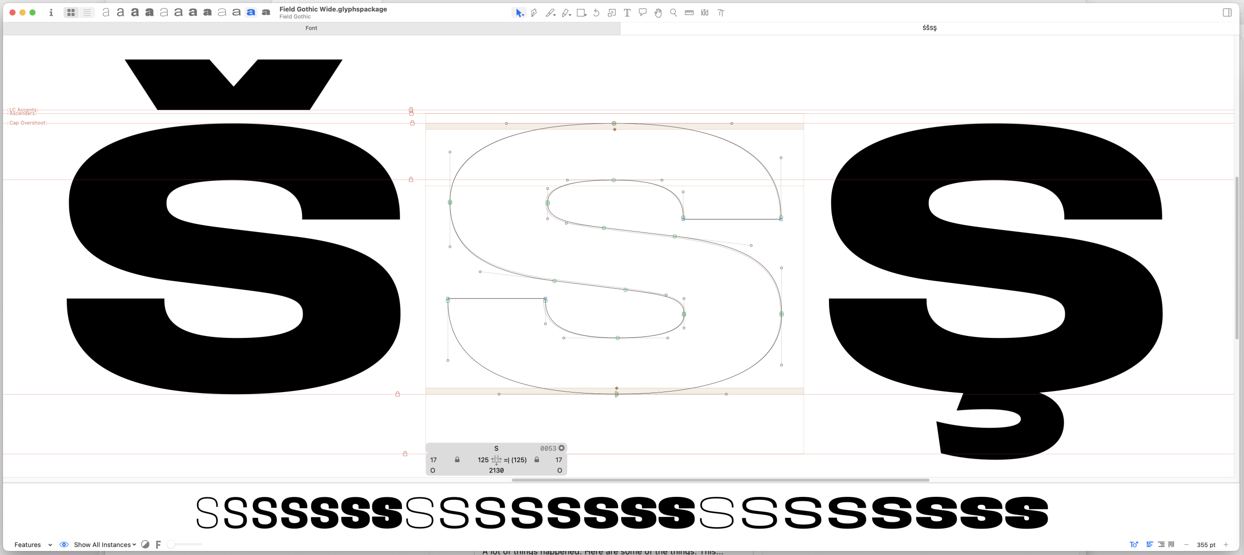
After that comes two to three test words (vector sketches, generally in a single weight) to show possible stylistic approaches. Test words are the most critical part of the process, since they set the direction for everything that follows. The usual ask is for something ‘ownable,’ which is fair enough, and often ‘unique,’ which probably requires more discussion.
When people talk about making a typeface ownable, they're often talking about adding tricky details: terminals lopped or rounded off at angles, arbitrary stencil cuts, hidden images meant to make symbolic statements about the brand. And these can play well in the conference room, where people are giving type their full attention. But they’re less effective out in the real world, where people read type instead of studying it. And attention-getting forms can interrupt the smooth flow of reading and distract from your message.
The fact is, type is not perceived as a series of individual letters, no matter how striking those letters might be. What makes a typeface memorable and distinctive is the overall effect of rhythm, weight, proportion, tone, and cultural associations. These by themselves, without any visual gimmicks, can produce endless variety, and have infinite expressive potential. They form what psychologists call a gestalt, which functions as a sort of visual personality. And creating a personality is what every successful brand must do.
With custom type, the point is not to be unique. It’s to be recognizable and true to the brand. And making type inviting to read increases the chance it will be read, in which case its formal and emotional qualities will subconsciously shape the reader’s experience in your favor.

Once a test word is approved, most jobs need about six weeks for the production of beta fonts. These generally contain full character sets, functioning OpenType features, and letters quite close to their final forms. But those forms, along with their spacing and kerning, won't be fully refined, and the fonts may not be entirely free of technical glitches. Beta fonts let the client test-drive the design to see how it performs and the effect it creates.
The final few weeks after approval of beta fonts are mostly given over to refining letterforms and spacing. The idea is to iterate well past the point of finding and fixing problems. The forms should be affirmatively right: not just readable, but a pleasure to read. Last of all comes a rigorous quality assurance regimen, sometimes carried out with a font engineer, to make sure the delivered fonts are clean and technically robust.
All in, a typical custom type project will take three or four months from acceptance of bid to delivery of finished fonts. Large organizations with many stakeholders might want to allow more time than this, since getting approvals is sometimes the most time-consuming part of the process.
If you don’t have the time or budget for a fully bespoke branding face, a few strategically redesigned characters can do wonders for the fit and ownability of a retail typeface. We’re always available to customize any face in our library (or, if the rights can be secured, any other library). And we can extend the language coverage of existing typefaces as well, working with experts in non-Latin scripts where appropriate.
Logo Development
Brandmarks and icons are governed by the same optical laws that govern type. Rhythm and curve quality are still key to earning visual credibility. Letterforms still need the same amount and kind of optical correction, whether they’re part of a page of type or a wordmark. Clothoid curves are still needed to produce a smooth transition from straight to round. Dark shapes still seem to contract; negative shapes still expand.
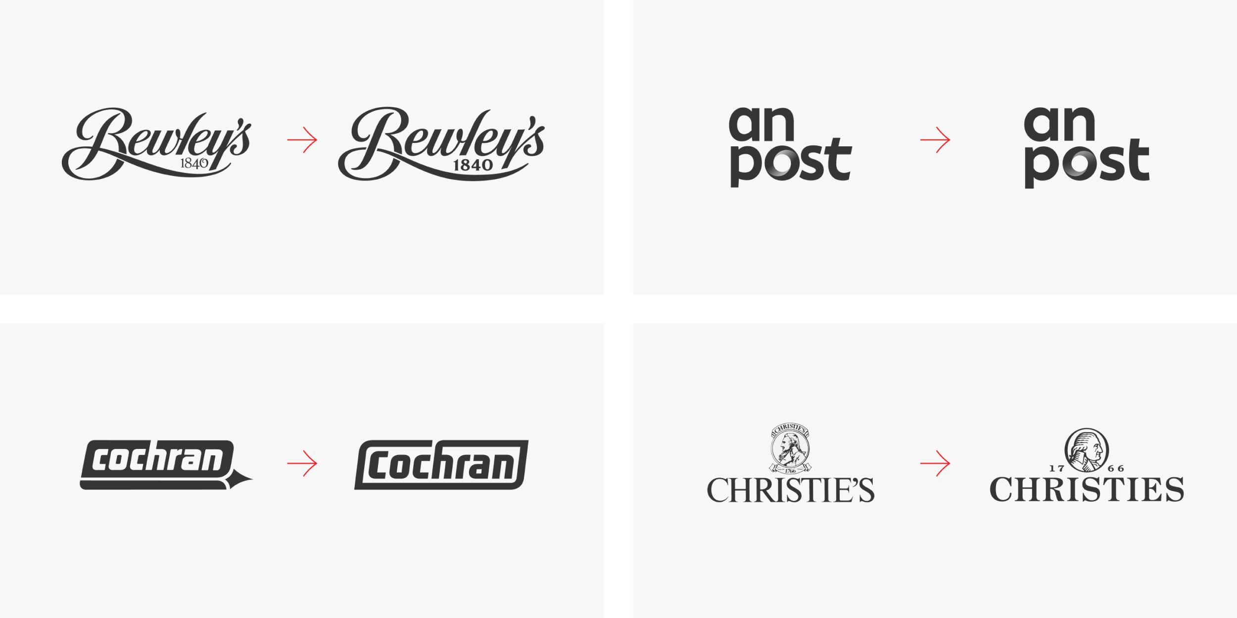
I have a lot of experience gently updating legacy brands, and of bringing draft designs to a higher level of craft. And, of course, I also design new entirely marks, either independently or in collaboration with other studios.
I was originally trained as a painter, and in a pretty old-fashioned way: plaster casts, life models, and honest-to-God still lifes with skulls and fruit. So I know how to draw things that aren’t letters, including logos, icons, emblems, badges, pictograms, mascots, signets, manicules, ornaments, and crests. And since I’m a type designer, I know how to make things look good when they’re small. Icon-making isn’t relevant to every job, but when it’s needed, it’s a nice skill to have.

Retail Library
In general I try to stock my retail library with the kind of type I’d want to use. That means painstakingly made letters with well-thought-out glyph sets and thorough but modest kerning; an overdone T/o kern can briefly spoil the pleasure of a page. I'm also fussy about curve quality, balance, and the design of crisp, clear junctures. Typographers talk about ‘color’, the overall impression of a block of text. I work hard to achieve a clean, open typographic color.
For this reason, I often include non-standard non-connecting ligatures to avoid visual pinch points, even if there’s no danger of outright collisions: for instance, non-joining g_g ligatures, where the loops are slightly narrower to avoid jostling. And I often draw a narrow alternate f to keep it from fighting with letters like ï or ì.
I generally draw Polish ogoneks individually for each character, rather than using a one-size-fits all approach, so that the accent grows organically out of the base form. I include case-sensitive punctuation and separators as part of my standard glyph complement, as well as directional arrows; you never know when they might be needed for picture captions or signage programs. This sort of stuff isn't showy. You can’t see it unless you lift the hood. But it's meant to improve things for both readers and designers, and I believe it does.
Of course, as mentioned above, any face in our retail library can be customized or expanded to meet a client’s needs.

Collaboration
Everything I do is a collaboration of some sort. While I’m Signal's only full-time employee, over the years I've assembled a small group of trusted colleagues who can be brought onto any project according to need. Their skills include web development, font engineering, and non-Latin script consultation, as well as type design. But my chief collaborators are my clients.
With brandmark work, I can design independently from your brief, or apply a final French polish to your essentially finished design, or anything in between. I'm less flexible with typeface design simply because there are so many specialized and technical requirements involved, but the goal is always to realize the client’s vision.
Good collaborations require good client relationships, and these need what any relationship needs: clear communication, mutual respect, and a recognition that neither designer nor client know exactly what’s wanted at the outset of a job, and that they have to work together to find out. I pay a lot of attention to process and have been rewarded with some lasting and productive partnerships.
Clients I’ve collaborated with include BBDO, Bewleys, Christies, Mark Porter Associates, Pentagram, Publicis, and Virgin Media. And the results have been recognized by the Type Directors Club, Communication Arts, Graphis, the ISTD, ICAD, and the 100 Archive.
My name is Max Phillips. Give me a shout if you’d like to discuss a job, or just want to say hello.
