Reckham


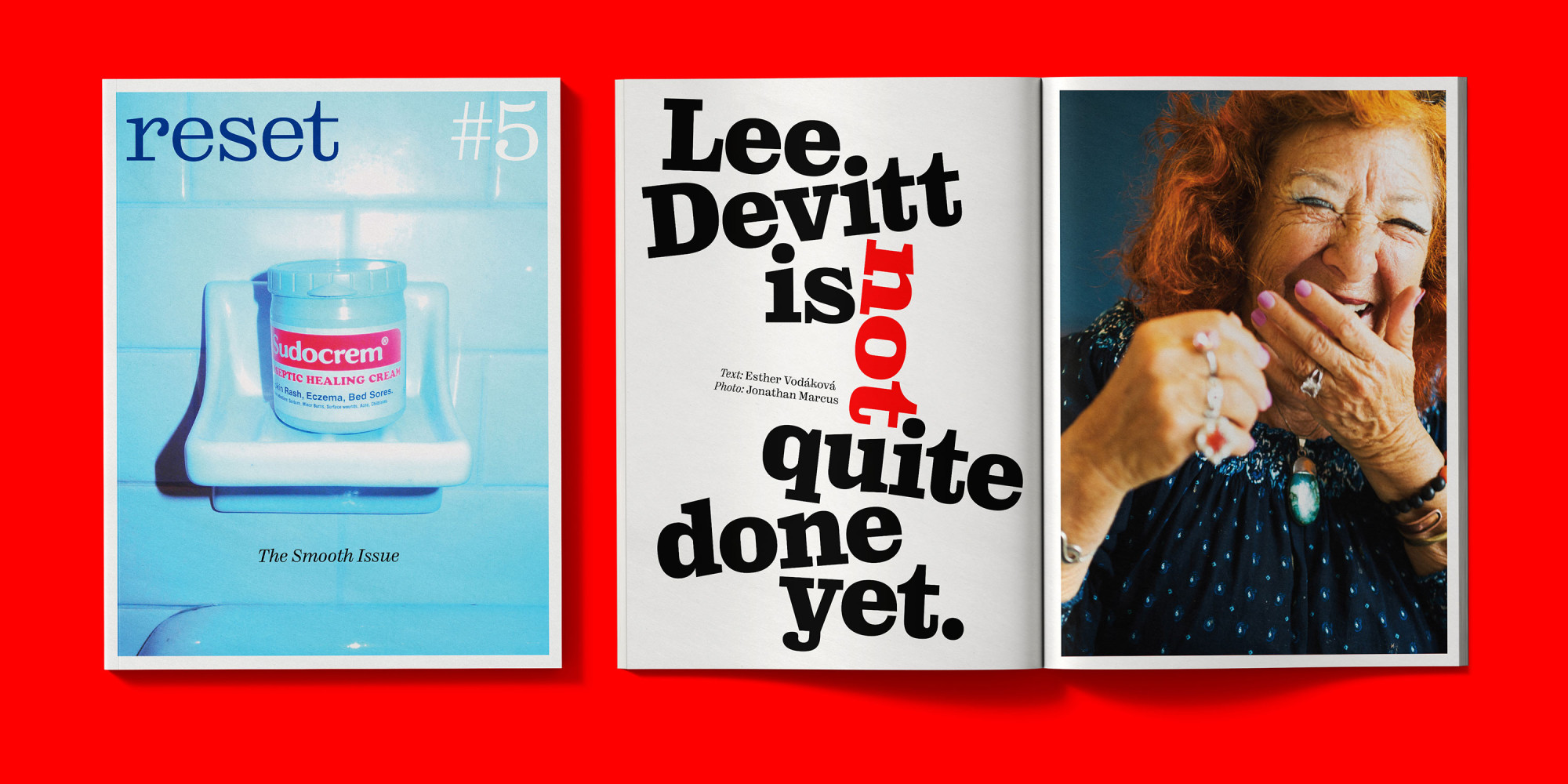
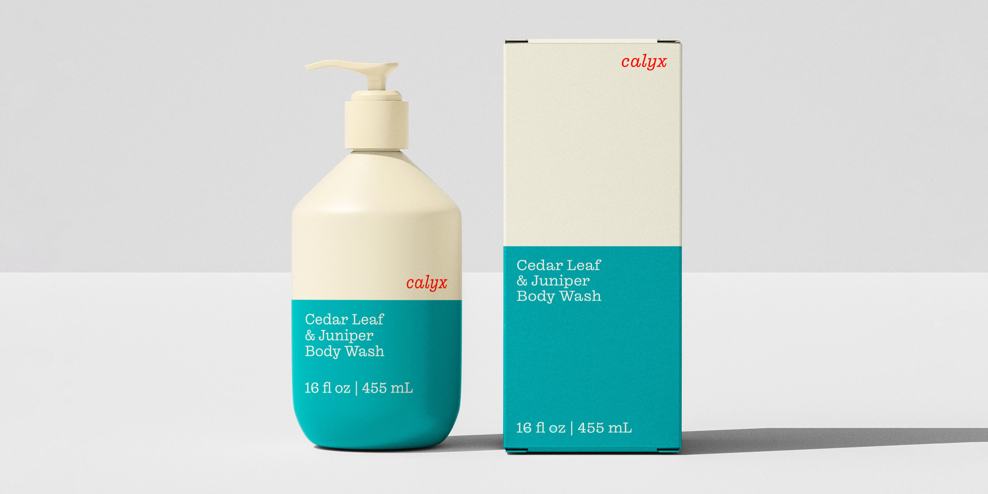


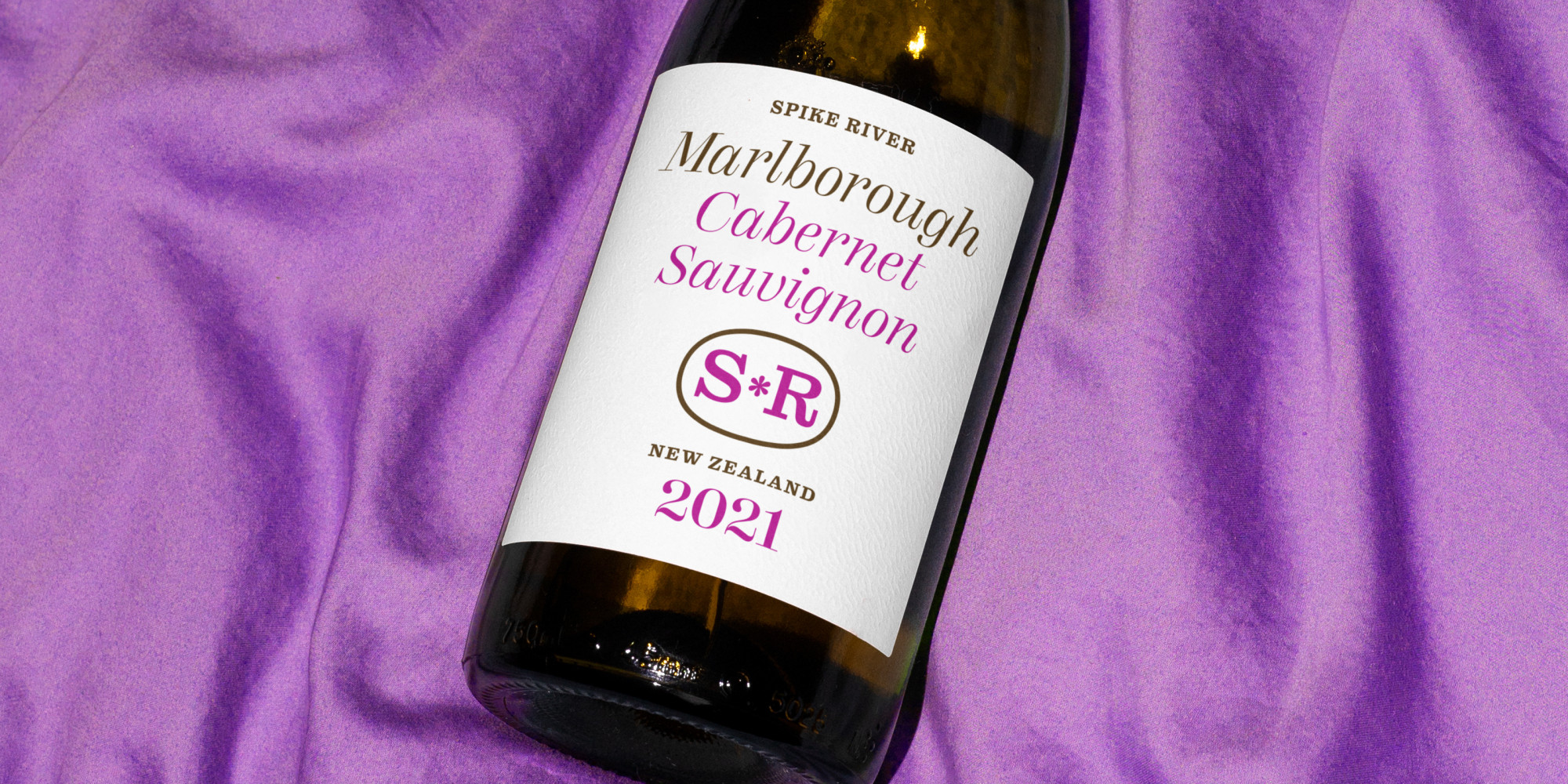
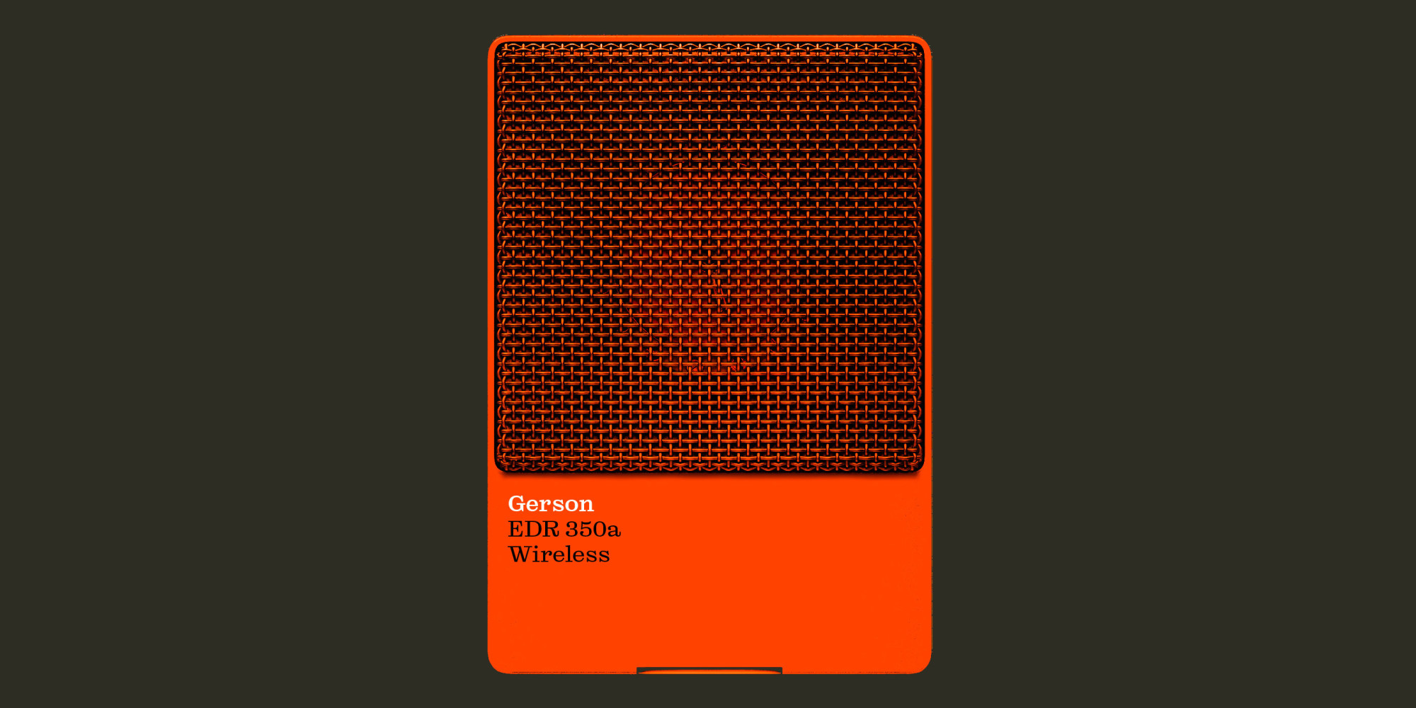


Reckham is a mutant Scotch Roman. We wanted to draw a Century Expanded that turned Clarendon when it got bolder, but somewhere along the way the serifs came unbracketed and our ideals of clarity and rigor had to make room for a few eccentric details. Then we couldn’t decide on a degree of contrast, so we went with all of them. The №1 Series, with its hairline thin strokes, is nearly Didone, and its blackest weights are Fat Face. The nearly monoline №4 Series is typewriterish in the lightest styles and Egyptian in the darkest. №2 and №3 Series represent sturdy and quite readable steps along the way. The result isn’t what we expected, but it must have been what we wanted. Four degrees of contrast, six weights with matching italics, 48 styles in all. The full family includes variable roman and italic fonts, so users can fine-tune weight and contrast to suit themselves.
To buy a license, please visit this site on a desktop, laptop, or tablet computer.