Irish Independent
Agency: Mark Porter Associates

Founded in 1905, the Irish Independent has for decades been the largest-circulation newspaper in Ireland. But in recent years it’s faced the same challenges as most print media outlets: aging readership, declining circulation, competition from social media and free digital news, and diminishing trust in journalism. In response, their leadership moved to rationalize their print titles, upgrade their Web, app, and podcast offerings, and consolidate the substantial combined equity of these properties into a unified multiplatform news brand expressing relevance, modernity, and Irishness. To support the rebrand, they hired Mark Porter Associates, who brought in Signal as typographic consultant.
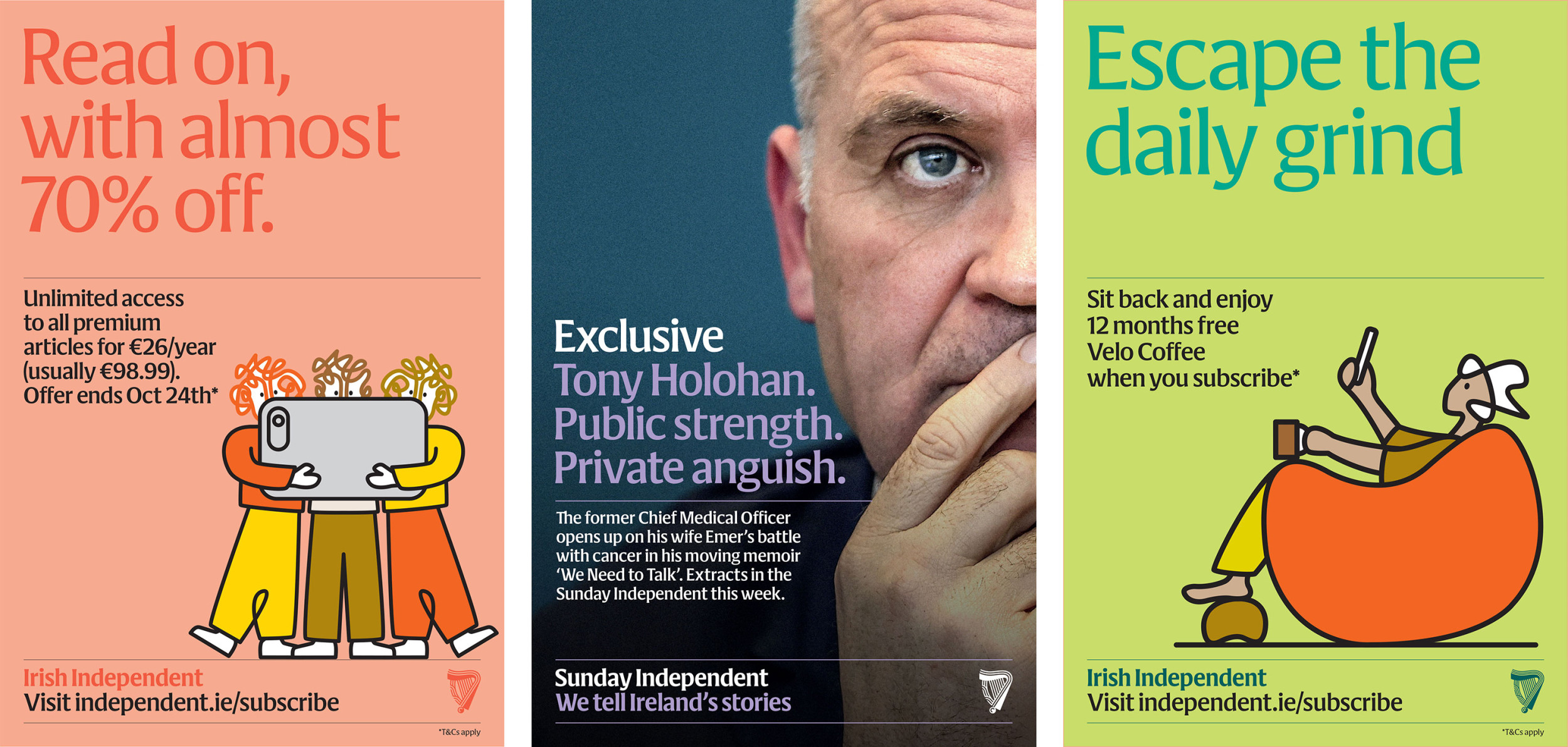
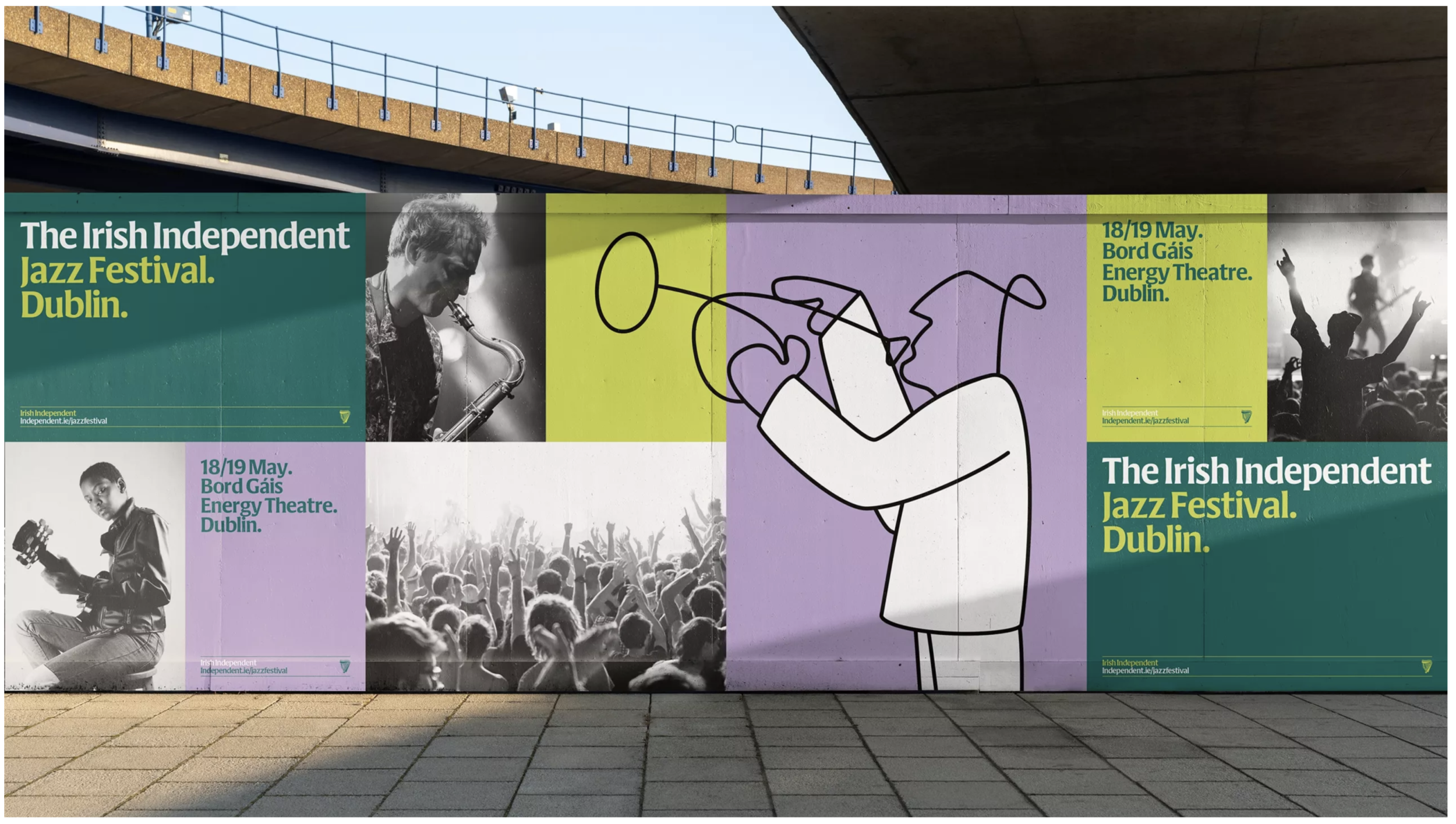
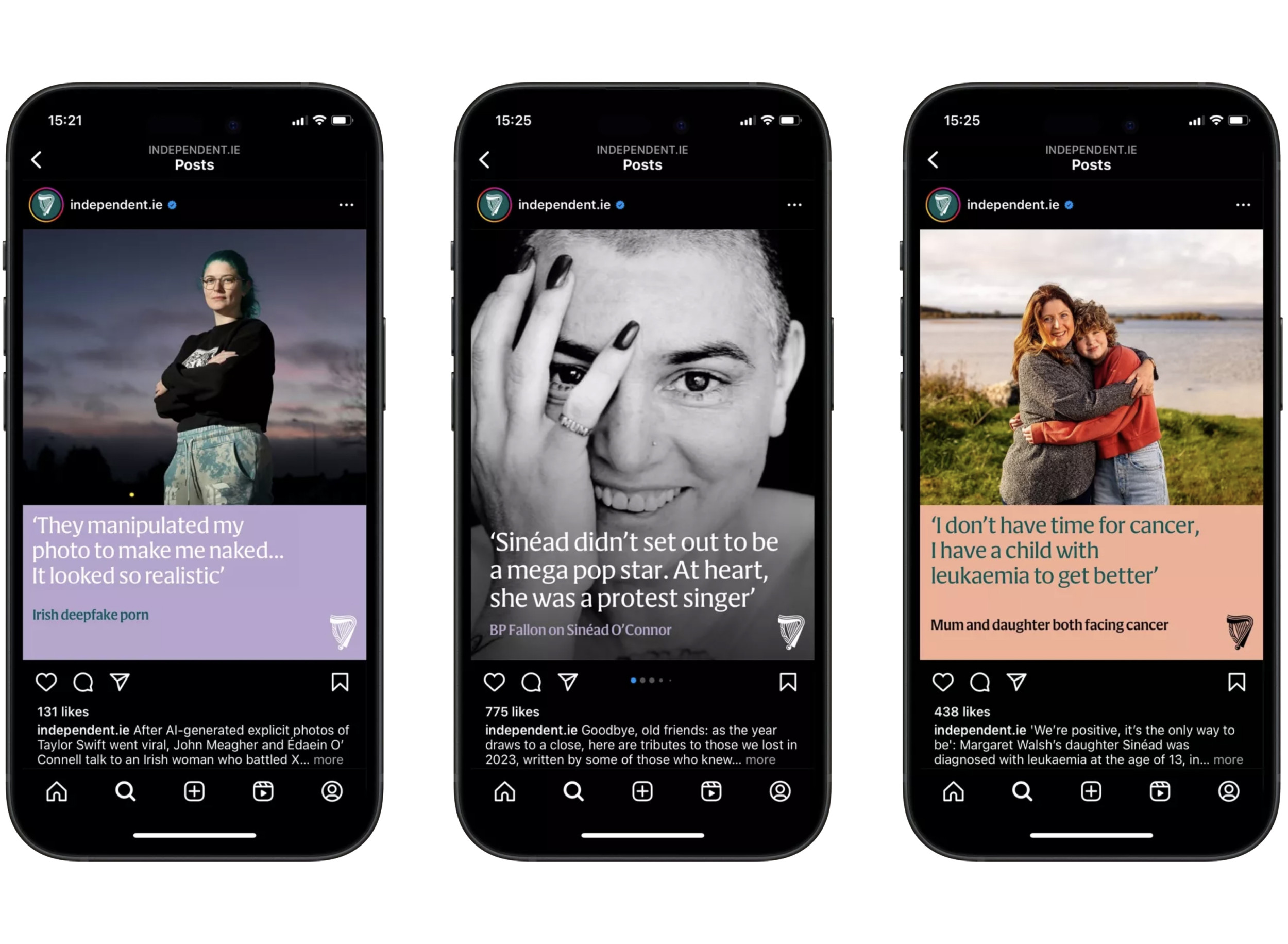
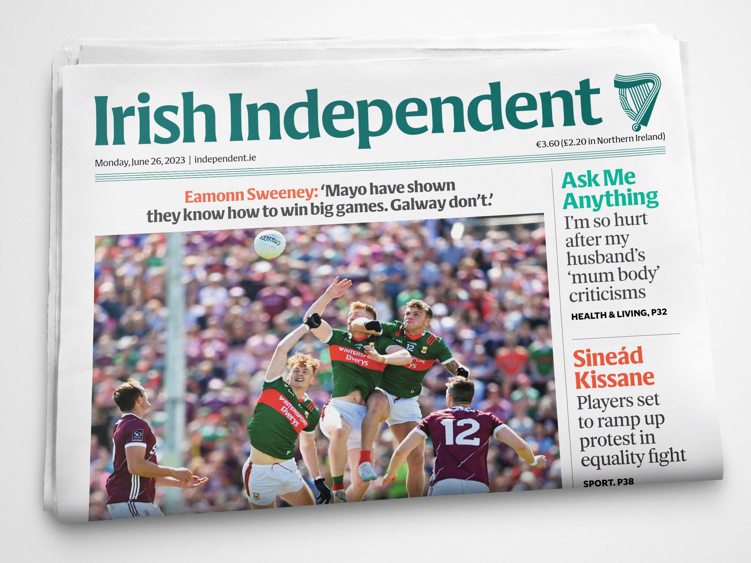
The Independent already had an extensive custom type system and wanted to retain it. But while well-made, these faces did not strongly differentiate them from their competitors. We proposed a new branding face, one designed to work harmoniously with their existing type palette. Cláirseach (Irish for harp) is a four-weight flare-serif inspired by the distinctive wedge-shaped serifs of insular calligraphy. We also redrew their well-known harp emblem to make this omnipresent national symbol fresher and more ownable. We based the new mark’s silhouette on the Independent’s original 1961 harp, which sported a distinctive rounded rest at the base of its frame. To unify the mark visually, we constructed both the frame and the strings from parallel stripes, a key formal element in Irish decorative arts since the Neolithic Era. The new harp is available in three optical sizes to suit a wide range of applications and environments. Illustrations by Andy Goodman. Direction by Mark Porter Associates with Clare Bell. Winner of ISTD Certificates of Excellence for both rebrand and branding face.


Agency: Mark Porter Associates