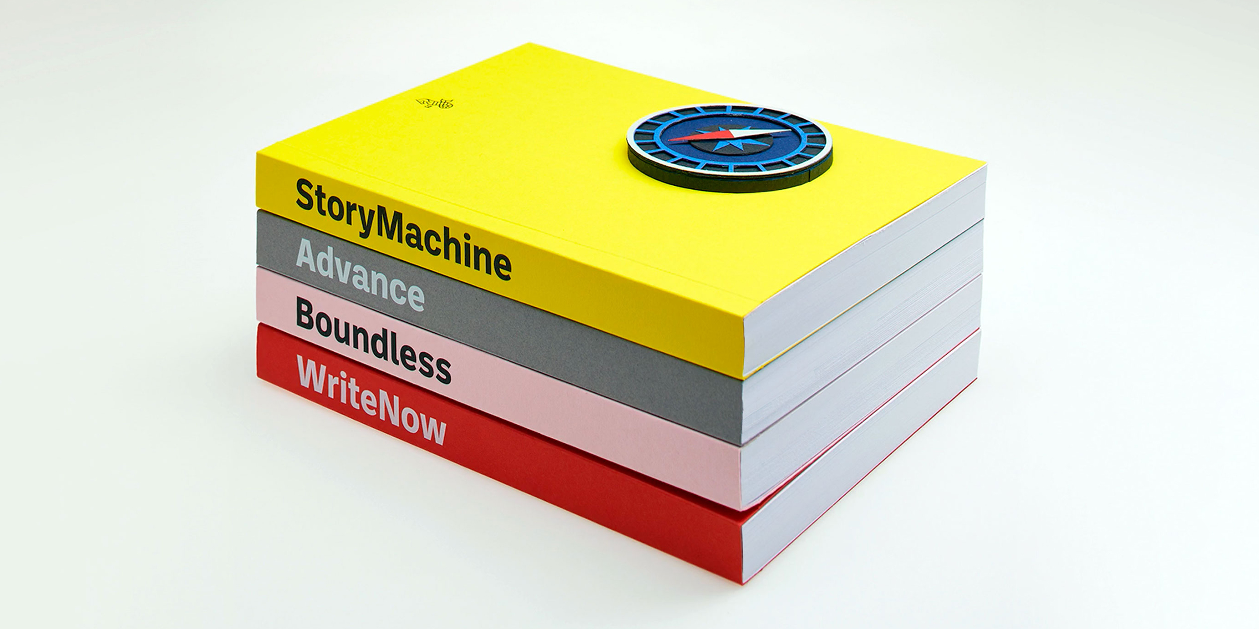
Ballinger Standard
Ballinger began life as a proprietary single-weight face called baasic, designed for Dublin-based design office aad. baasic was intended as a plain, hardworking grotesque: a simple tool for clear communication. We’ve developed it into a fully-featured eight-weight workhorse family with matching italics, plus condensed and monospaced companions. Sources include early 20th century jobbing sanses like Morris Benton’s News Gothic and Candia, a 70s-era typewriter face that Josef Müller-Brockmann designed for Olivetti, which had unusually deep junctures that added energy to letters like m and n. Ballinger has large counters and a generous x-height. Letters like a, e, and s open out gradually as they move from Thin to Black to maintain ample apertures, even in the darkest weights. Semi-oldstyle figures are available, as are case-sensitive punctuation and delimiters. Italics incorporate subtle ogee curves to lend warmth and energy to the page or screen. Ballinger includes Greek, Cyrillic, and support for over 150 Latin-based languages, including Vietnamese. Winner of an ICAD Gold Bell.
To buy a license, please visit this site on a desktop, laptop, or tablet computer.


