Dashiell Bright
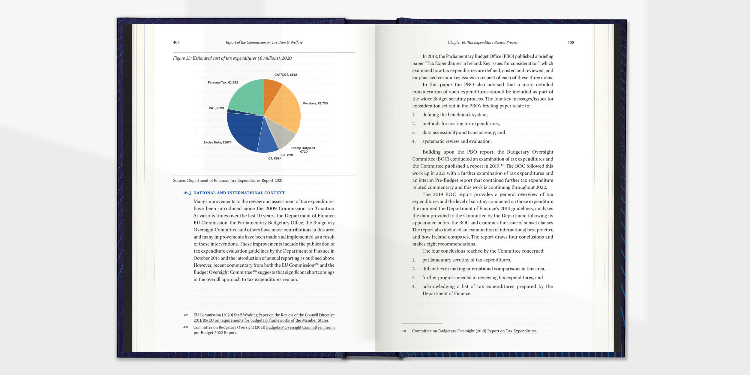
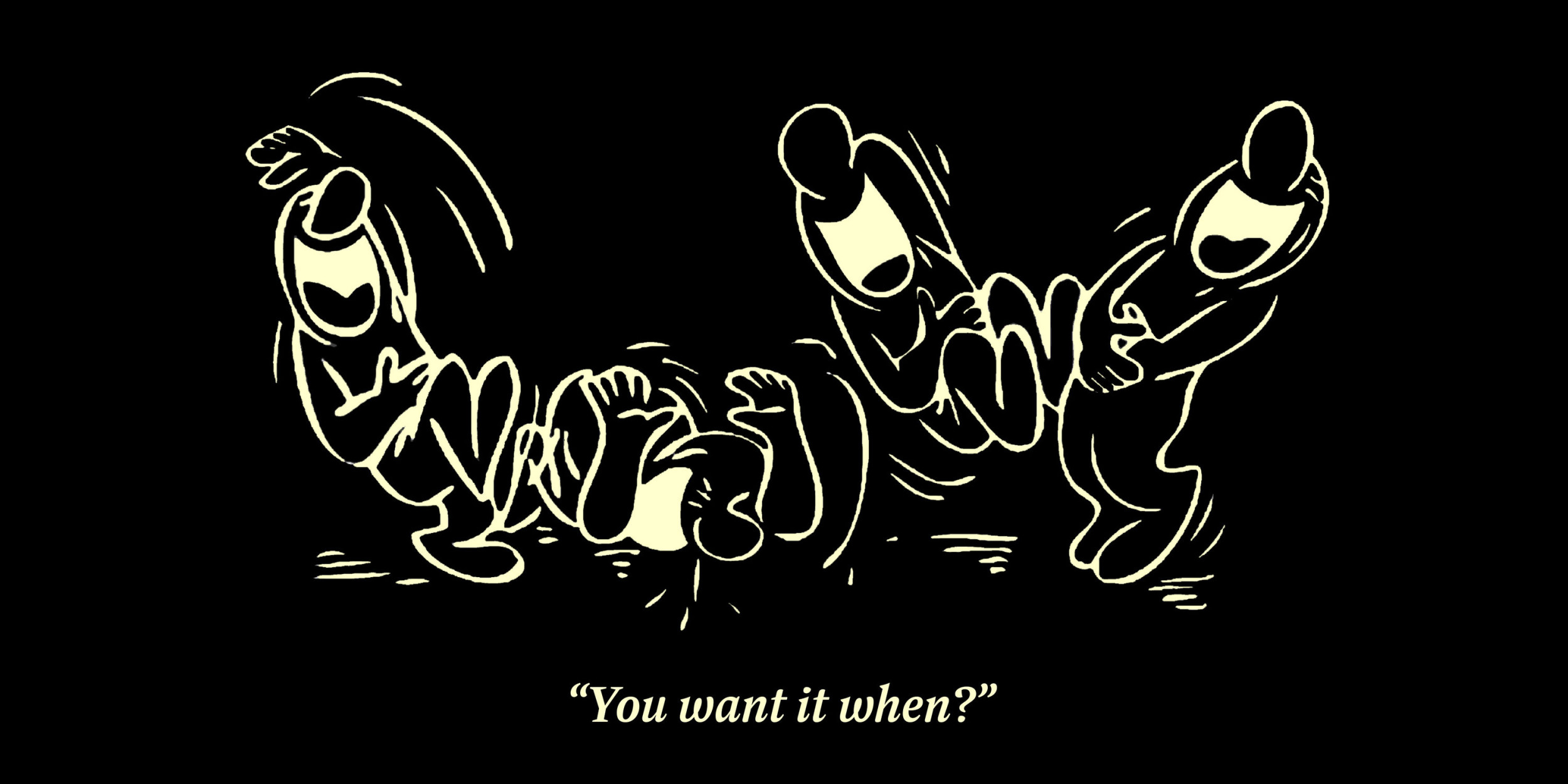
Dashiell Bright has more sparkle than Dashiell Text, with subtly finer hairlines and serifs, and is particularly suited to printed books and magazines, where its crisply drawn forms hold the page nicely without being overbearing. While a touch more literary than Dashiell Text, it shares the same six weights, ample counters and x-height, and unbracketed wedge serifs. Like its sister, Dashiell Bright supports over 140 languages and includes proportional and tabular lining and oldstyle figures, small caps, case-sensitive punctuation and delimiters, and a selection of borders and ornaments. Of course, it pairs well with its sister faces, Dashiell Text and Dashiell Fine.
To buy a license, please visit this site on a desktop, laptop, or tablet computer.


