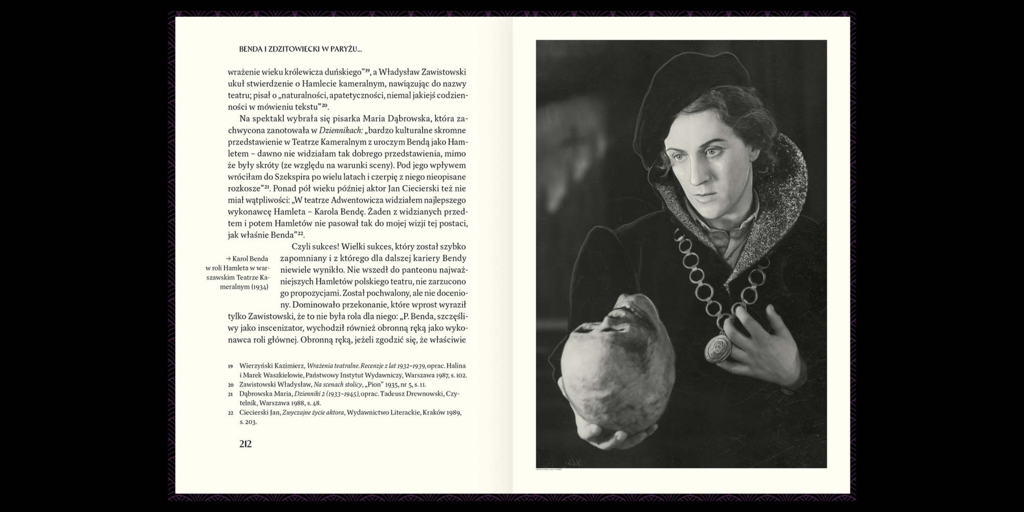
Dashiell Text


Dashiell was made to be read. Designed by a devoted reader with lousy eyesight, it’s an attempt to combine the warmth and frankness of Caslon with the lucid elegance of Garamond. Counters and x-height are ample but not large. Apertures are moderately open, and unbracketed wedge serifs add crispness. The collection includes three families: Dashiell Text, Dashiell Bright, and Dashiell Fine, for a total of 31 styles. Dashiell Text is the anchor: an all-around workhorse with quiet detailing and modest contrast, carefully balanced to work both onscreen and on paper. It’s available in in six weights with matching italics. Regular weights are clear and open, but sturdy enough to perform at small sizes. The Black weights are unusually dark for a classic serif, with a hint of Cooper Black. Named for Dashiell Hammett, whose succinct grace helped modernize twentieth-century American fiction, Dashiell Text supports over 140 languages and includes proportional and tabular lining and oldstyle figures, small caps, case-sensitive punctuation and delimiters, and a selection of borders and ornaments. Of course, it pairs well with its sister faces, Dashiell Bright and Dashiell Fine.
To buy a license, please visit this site on a desktop, laptop, or tablet computer.