Field Gothic Narrow


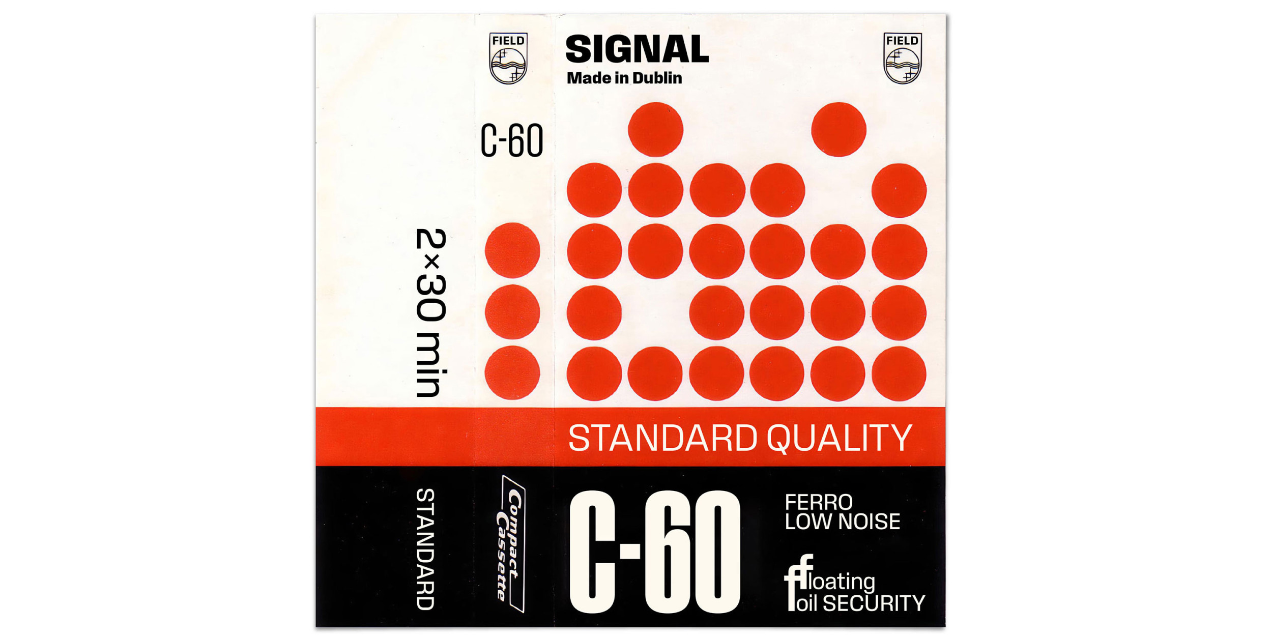


We never meant to design Field Gothic. All we wanted was a version of our Pressio with conventional rounded counters, which we thought might sell better to the corner-averse. But then we realized that, without those squared-off counters, we could do extra-light and hairline weights, and add more widths. And eventually Field Gothic snowballed into a 128-style, possibly-too-personal journey through the history of American and European sanses that may or may not parallel our own journey from New York City to Dublin. The Narrow Range draws inspiration from midcentury Geigy promotions, old Westinghouse lightbulb packs, sheets of Letraset Compacta, and yellowing copies of Twen. Overall, the look is crisp and on the cool side, with slightly superelliptical curves. The x-height is high; punctuation and diacritics are substantial. The lightest weights are almost monoline. Above that, arches and bowls have sharply contrasting junctures and a snug fit for maximum impact in headline sizes.
To buy a license, please visit this site on a desktop, laptop, or tablet computer.