Milgram

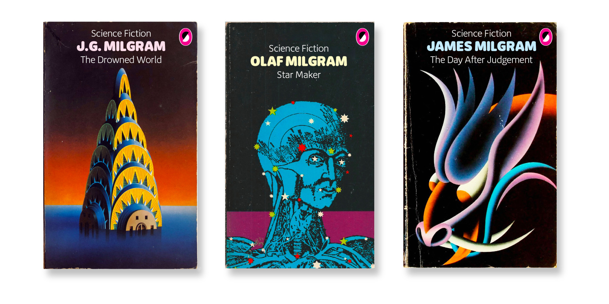

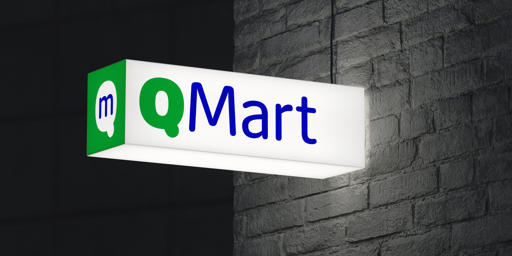

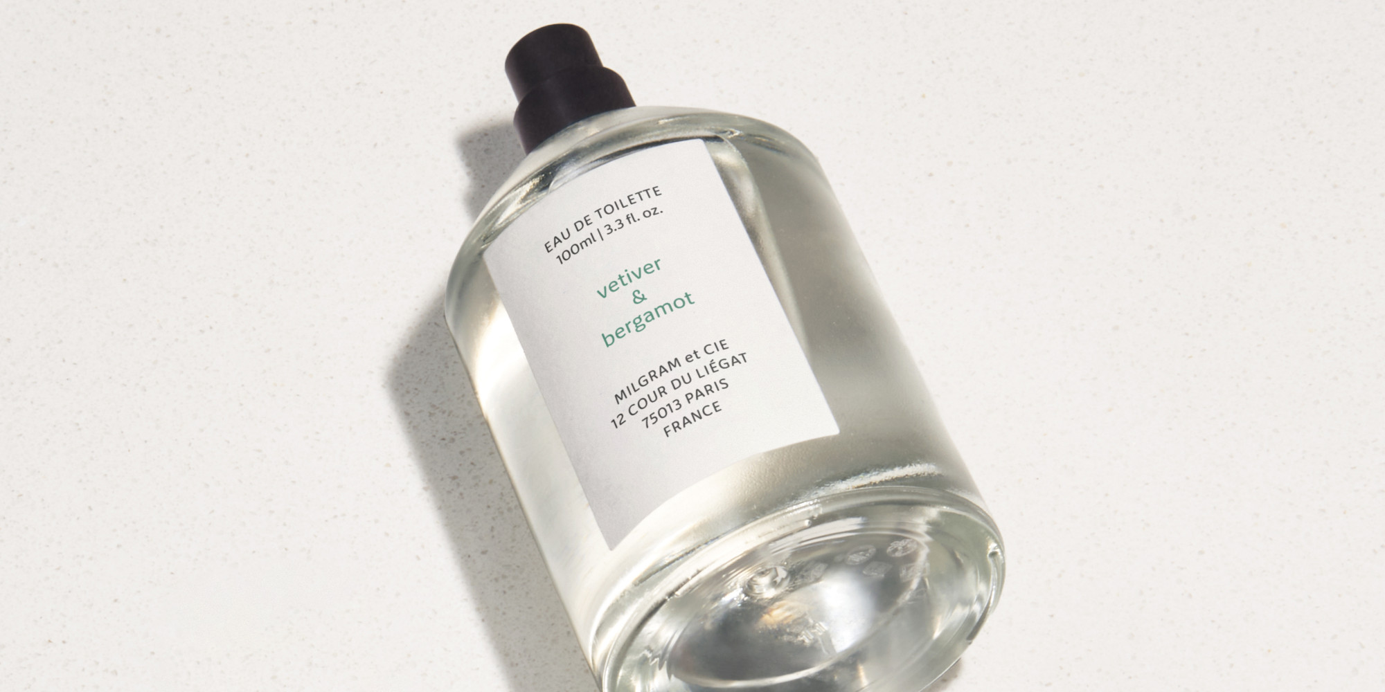

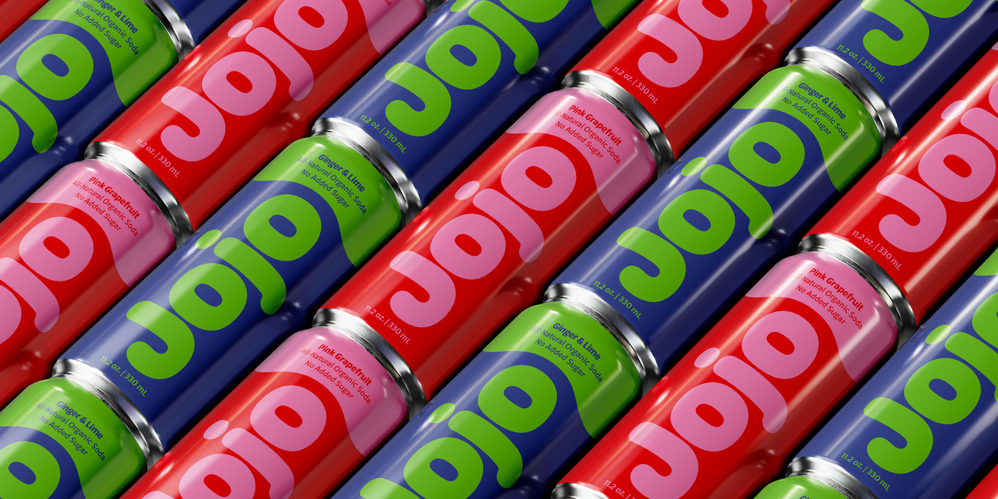


We’d always wanted to add a humanist sans to the library, and we’d always wanted to add a rounded sans to the library, and we thought we’d save time by making them the same typeface and see what happened, and what happened was a wave of nostalgia for the 60s heyday of Frankfurter and VAG Rundschrift and an all-caps dry-transfer face called Formula One that nobody seems to remember but us. The lightest weights have a slightly technical air, as if they’d been engraved on a glass beaker. In contrast, the Black weight is zaftig and maybe a bit Bootsy Collins. Counters and apertures are very open and contrast is low, for added readability. Is this our answer to Calibri? No, but thanks for asking. Supports 140-odd languages, including Vietnamese. Matching italics and a full release scheduled for mid-2026. In the meantime, if anyone wants to use this on a new edition of Michael Moorcock sci-fi, they would make us very happy.
To buy a license, please visit this site on a desktop, laptop, or tablet computer.