Thalo
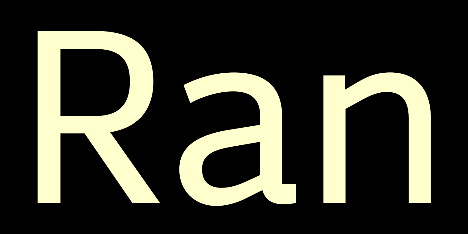
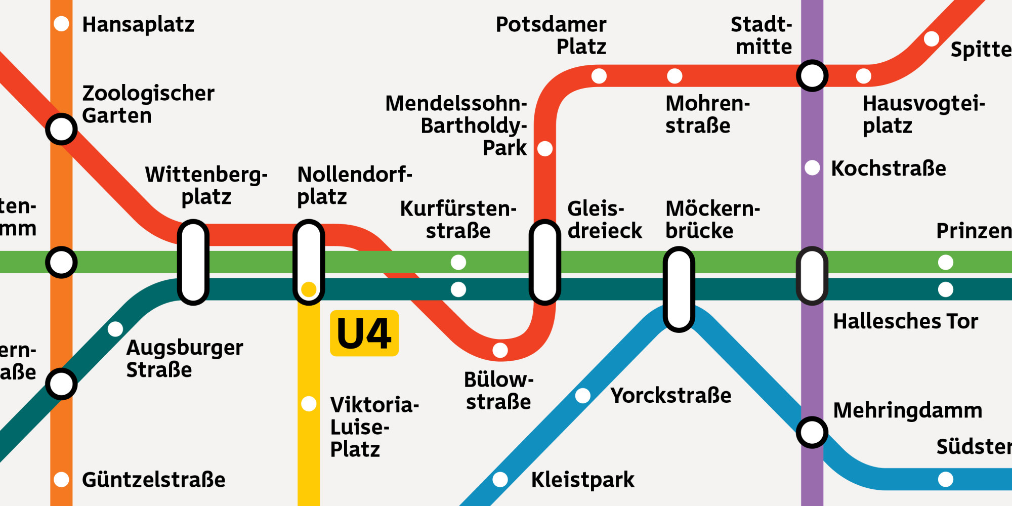
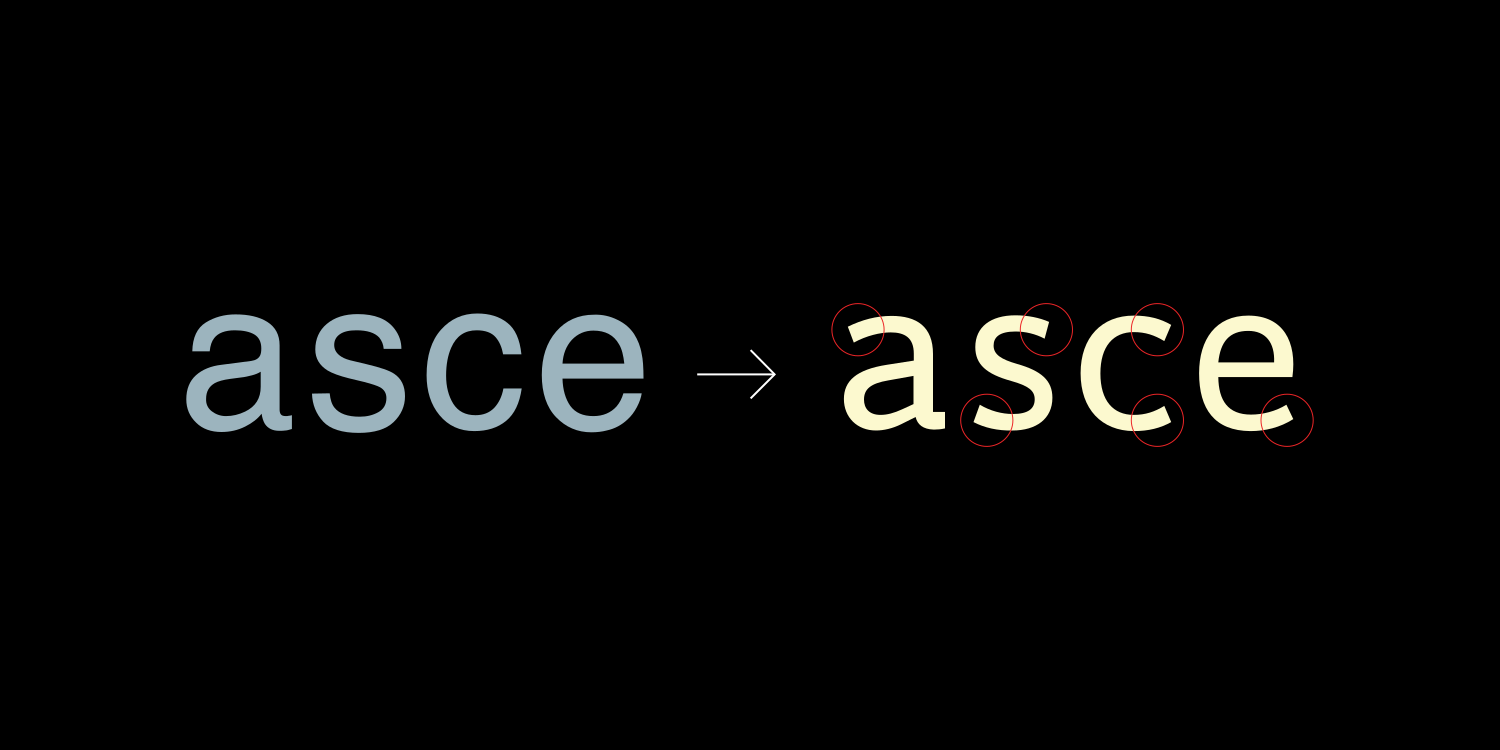
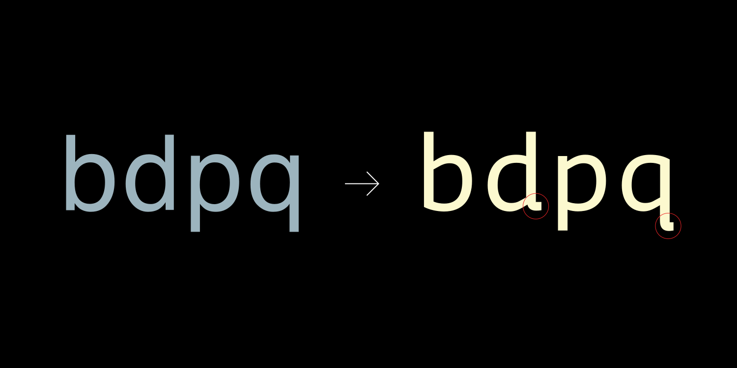
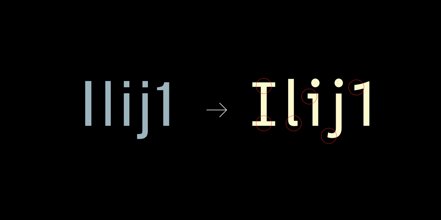

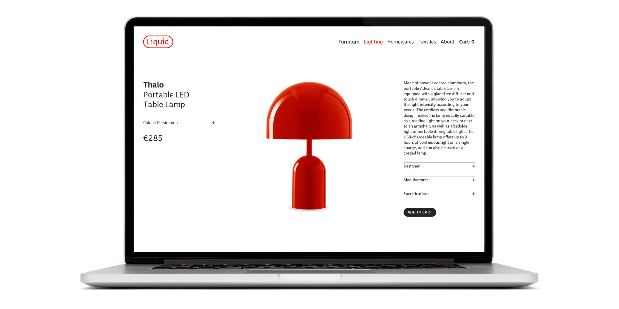
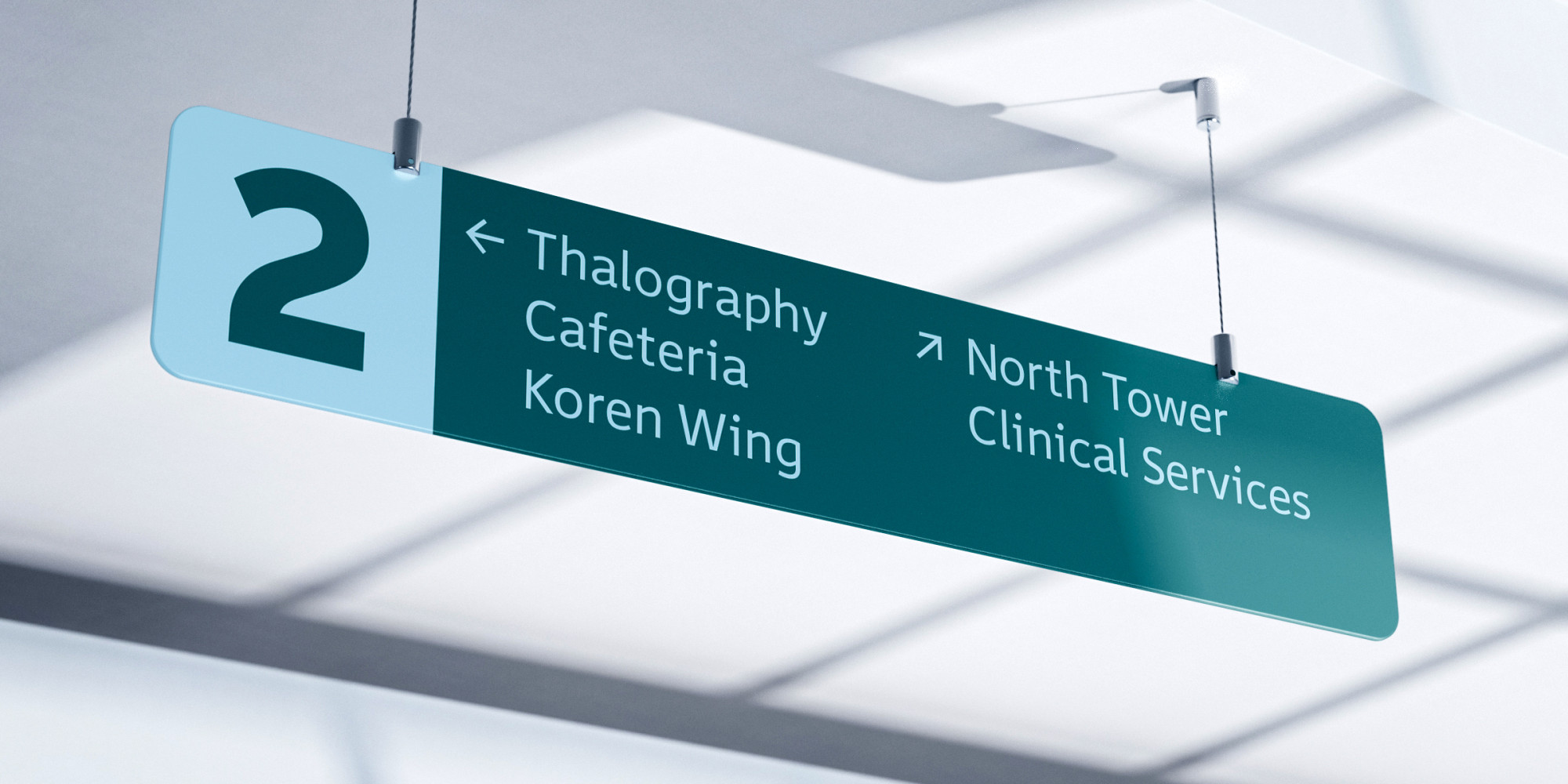
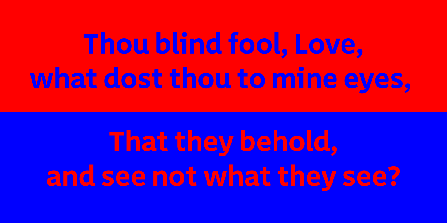
Originally commissioned for a state transportation agency as a fully accessible typeface for signage and timetables, Thalo is a six-style humanist sans that employs best design practices to support dyslexic and other reading-challenged populations. We kept the contrast low to increase visual cohesion within glyphs. Letterspacing and x-height are generous but not extreme. Counters and apertures are open. Letters like b, d, p, and q were carefully drawn to avoid dyslexic ‘mirror invariance’; bowls are asymmetrical for the same reason. I, l, 1, and i have been drawn for maximum distinguishability, with serifs for cap I, a tail for lowercase l, a wide flag for 1, and a head semiserif for i. Round bowls in conjunction with angular arches promote glyph recognition as well. The clarity of form that makes Thalo a natural choice for signage, maps, interfaces and timetables also lends it impact in branding and editorial work. Named for phthalo blue, our favorite color back in art school. We never learned to spell it properly, and by now it’s probably too late.
To buy a license, please visit this site on a desktop, laptop, or tablet computer.